Text Reflection – Advanced Text Reflections With A 3d Perspective and Effects in Photopaint!
Software: Corel Photopaint v11
It’s been a little while since my last Corel Photopaint tutorial simply because of the sheer volume of work I’ve experienced with the Pixel2life version 2 release AND the increase in submissions, but I’ve set aside a few minutes to put out something new for the minority crowd of Corel users. One of the tutorials I’ve seen the most lately for Photoshop is how to create a text reflection, so obviously this is a pretty popular effect that people are looking to do. I’ll admit right now, this is a boring effect that takes about 3 seconds to figure out, and quite frankly I think anyone who knows how to write text in Photopaint can figure out how to flip it over and make a reflection. No rocket science there. BUT what I don’t see is a few of the subtle tricks that help give the reflection that added 3D look and feel, along with a few other simple built in filter tricks to jazz things up a bit.
So today we’ll cover a basic text reflection effect along with added 3D perspective touch-ups and finally, some small filter tricks to liven things up a bit. Anyone and their monkey can create a simple reflection, so lets try to spice it up a bit shall we?
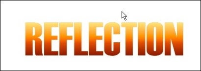
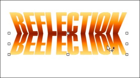
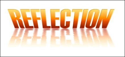
Here’s what we’re going to make:

*Puts on his glasses and bowtie and strikes a grandiose pose, chalk in hand*
Shall we begin?
Part 1 – Creating Gradient Text Without a Gradient Fill!
First things first, we’ll create our basic reflection with some nice pseudo gradient text. You can skip the gradient stuff and just use a single color text, but at least this will give you some experience with some of the nifty tools in Corel Photopaint. I probably use the Interactive Object Transparency Tool every time I open Corel, so naturally you’ll see me use it in a tutorial.
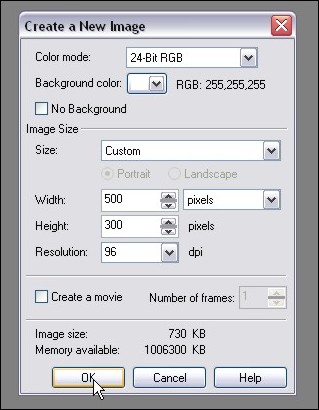
Step 1: Start up Corel Photopaint and create your new document. Here’s the settings I used for this tutorial:
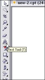
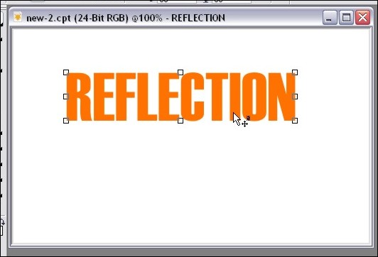
Step 2: Select your Text Tool from your toolbar (or hit T) and type out the text you want to use in whatever font you desire. I tend to use thick fonts for these effects so that my filter effects stand out better, but it’s totally up to you. Pick a nice bright color for your fill… I’ll use good ol’ orange!
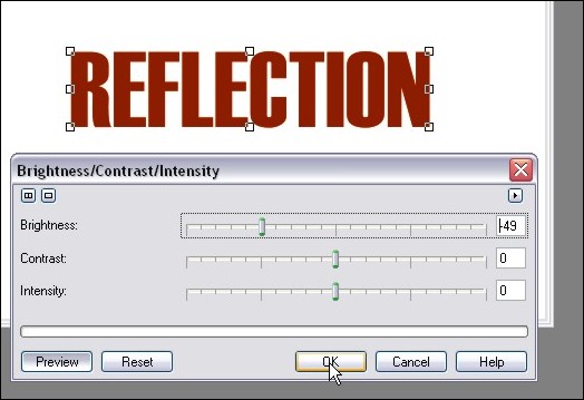
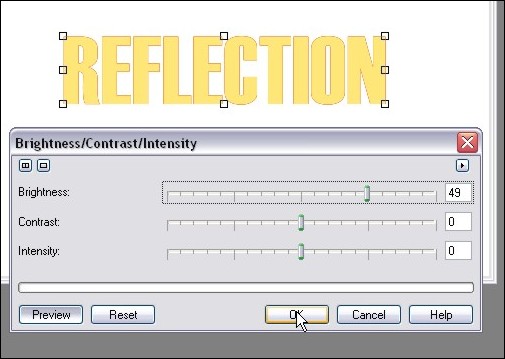
Step 3: Once your text is typed out, switch to the Object Picker Tool by hitting O and then create a duplicate of your text by hitting Ctrl-C (Copy) and then Ctrl-V (Paste). This will create a second set of the text. We’ll start creating our gradient text so click on Image > Adjust > Brightness/Contrast/Intensity and darken your text up a bit. Here’s the settings I used for a dark orange tone:
Step 4: Now create another set of that text by hitting Ctrl-V (paste), and then once again load up the Brightness/Contract/Intensity Tool and lighten that text up to a brighter orange tone. I’m uses these settings:
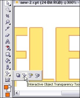
Step 5: Zoom in a bit and we’re ready to start our fake gradient effect! Now I know we can do this by creating a gradient style fill like in my orb tutorial, but this will help get you used to that wonderful Interactive Object Transparency Tool I mentioned.
So now now go ahead and select the Interactive Object Transparency Tool from your toolbar!
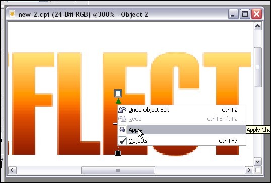
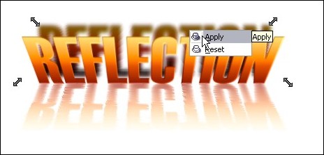
Step 6: Move your mouse cursor to the top of the text and click and hold down your left mouse button. That will lock where you want the solid part of the object to start. Next, drag your mouse downward and select where you want the object to end. When you’ve decided where the transparency should finish, release the left mouse button. If you’re happy with the preview, right click on your canvas area and click apply. If you don’t like it, hit Esc to start over.
Here’s the tool in action:
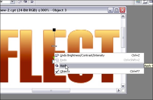
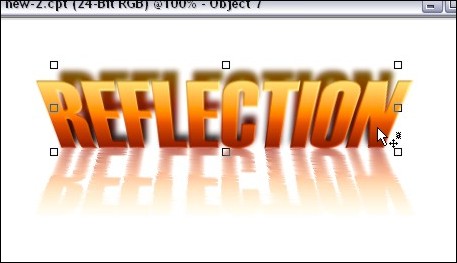
After I clicked Apply:
Step 7: Repeat step 6 for the darker text. First go to your object docker (If it’s not open, hit Ctrl-F7) and select the dark text object. At the moment you should still be on the light one. Once you’ve selected the dark text object by clicking on it in the object list docker, use your transparency tool again, but start from the bottom and go up instead of vice versa.
In action:
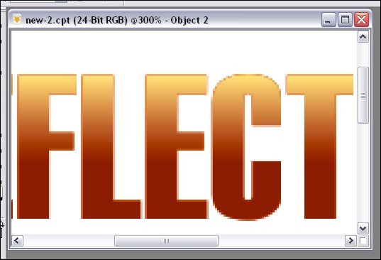
Final result:
Step 8: Now we’ll need to combine all 3 text objects together and make them a single object layer. Just hold down Ctrl and click on each text object in the Object docker to highlite them and then right-click on one of them and click Combine > Combine Objects Together.
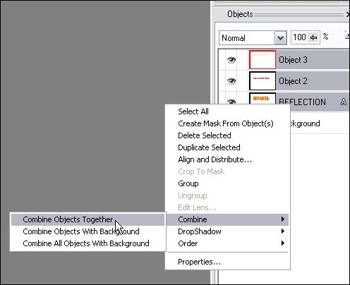
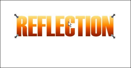
Once you’ve completed this step, you should now have your 3 color gradient text all in a single object.
Part 2: Playing with Perspective!
This step goes beyond your average reflection tutorial effect in the sense that we’ll play with the perspective to give this version some depth. The beauty of this effect is that you can play around with all kinds of versions. In this case, we’ll add a perspective to both the text and the reflection, but you don’t have to confirm to what I’m doing. You can apply the perspective to the text and NOT the reflection or do it the other way around and only apply a perspective effect to the reflection only. Or you can bypass the perspective twist altogether and leave everything straight up.
What exactly is perspective? Perspective is used in 2D images to give a sense of 3D depth. In the case of this tutorial, we’re going to bend text to appear that we’re looking at it from a top perspective. By changing different angles, we can completely change the overall perspective to suit just about any angle. Play around and see what you can come up with!
So let’s get crackin!
Step 9: Activate the Object Picker again by pressing O and then click on the text object 3 times. On your third click, you should see double arrows angled at 45 degrees on each corner of the object. If you don’t see those arrows, just click on the object until they come up. You should see arrows that look like this:
Step 10: Click and hold the arrow at the top right and drag it to the right to angle the top corner outward. Release the mouse button and your angle will be set. Now click the top left arrow and drag it to the left. Release when you have an angle you want to use.
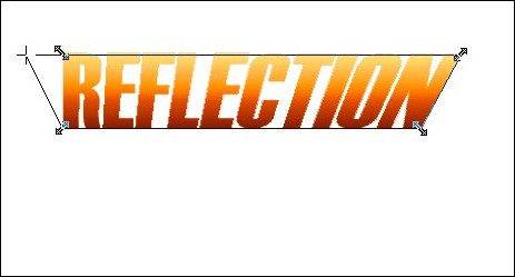
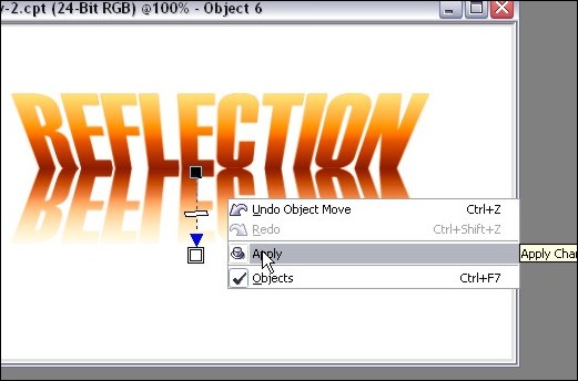
If you’re happy with your changes, right click on the object and click apply. If you want to start over, hit Esc.
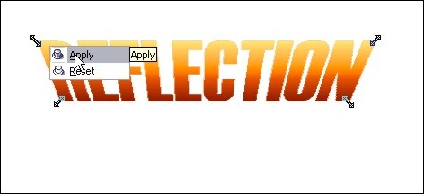
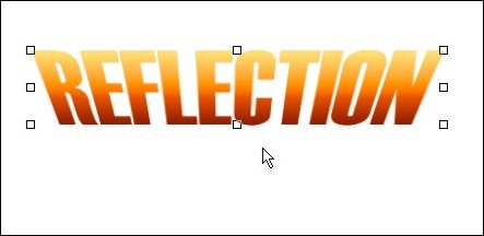
Once you click apply, your new perspective angles are applied to the object:
Part 3: Create the Reflection!
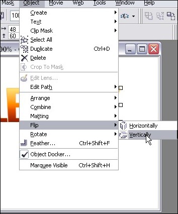
Step 11: Now we’re ready to create our reflection and play with some effects! So first hit Ctrl-C (Copy) then Ctrl-V (Paste) to create a copy of our text object. Once you have tha done, click on Object > Flip > Vertically.
Step 12: Use your mouse to click on the “upside down” text and drag it so that the top of the “upside down” text lines up with “right side up” text. You can choose to have the two objects touching, or try it with a little gap between the two. With a space, it’ll look like the object isn’t quite touching the “reflective surface”. For this tut, I made it touching…
Step 13: For an added effect, we’ll have our reflection fading out as it gets further from the object. You can leave it completely intact if youw ant, but I like it better this way. So take out the good ol’ Interactive Transparency Tool again and starting from the top of the reflection, fade it out at the bottom.
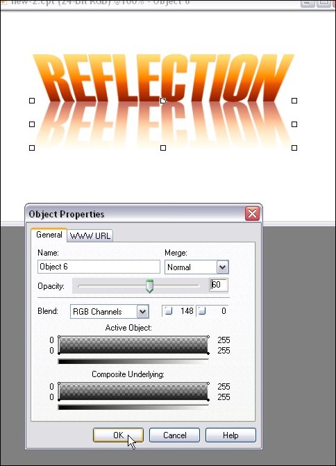
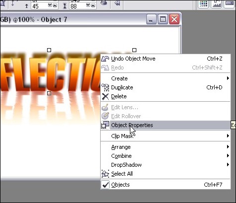
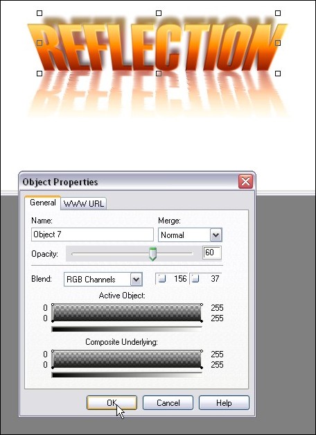
Step 14: You may feel that the reflection is still a bit too powerful, so we’ll tone it down a tad. Right-click on the reflection and click Object Properties. In the box that opens, lowe the opacity to tone down our reflection. I set mine to 60%:
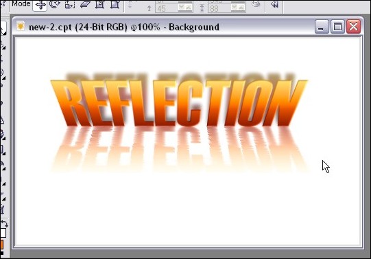
And now our reflection is done! You can quit while you’re ahead or we can play around a bit with the built in filter effects and jazz up our reflection a bit more! If you’re feeling brave, here’s some tricks I used to acheive the final image! (Don’t you hate tutorials that show you a “final image I made” but don’t show you how exactly they did it?).
Part 4: Playing with Filters!
Step 15: If you’ve ever seen a reflection in water, it’s not always a perfect pane of glass type of reflection… it’s usually rippled with a bit of distortion. Well we can easily achieve this with the Wind effect! Make sure you’ve selected the reflection object with your Object Picker and then click on Effects > Distort > Wind. We’re going to distort both to the right AND left for this effect, so here my settings for the two times I ran the filter:
First pass goes towards the left (Note the angle dial):
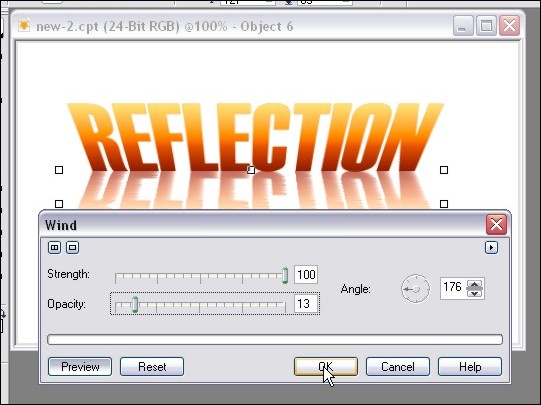
Second pass goes right:
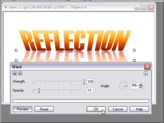
And you’re done your rippled reflection!
Step 16: Let’s increase the 3D look of our initial text shall we? Select the main text object with your Object Picker and then click on Effects > 3D Effects > Emboss. Play with the 2 sliders to see what it does to your image! Here are the settings I used:
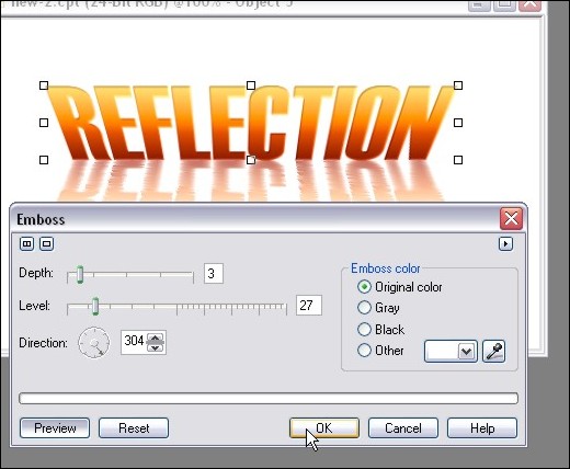
Here’s how our reflection is looking so far:
Step 17: Shall we add some shadows to our artwork? Well it certainly won’t hurt to acheive additional depth to our image! We’ll need to create another copy of our text, so once again, hit Ctrl-C (copy) and then Ctrl-V (Paste).
Step 18: As we did in step 3, load up the Brightness/Contrast/Intensity adjustment tool and darken our new text object. Here’s the setting I went with:
Step 19: Now we need to move things around a bit in the object docker so that the dark text is in the background. Click and hold the dark text object in the Object Docker and move it down so that it’s under the first text object layer. This will move your dark text behind the brighter one like this:

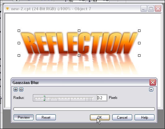
Step 19: Let’s add a little bit of a blur to our shadow. Click on Effects > Blur > Guassian Blur and apply a small bit of blur. You can play around with different settings, but I usually use a blur of 1 to 3:
Step 20: Use the up arrow on your keyboard to move the shadow up a few pixels, or just drag it up slightly with your mouse:
Step 21: More perspective? Well, it’s not necessary but I figured a bit of a perspective change on the shadow would add some “Je ne sais quoi” 😉 So once again click on the object until the perspective arrows show up and then drag the upper corners to the desired angles. Here’s how I did it:
Step 22: After I applied my new angles, the shadow was a bit too high, so I moved it down about 4 pixels… just being picky I suppose. Here’s where things are at:
Step 23: Once again we can tone down the shadow by right-clicking on the object and clicking on Object Properties:
I turned down the opcity to 60% for this tutorial:
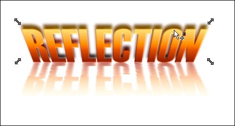
And now we have this:
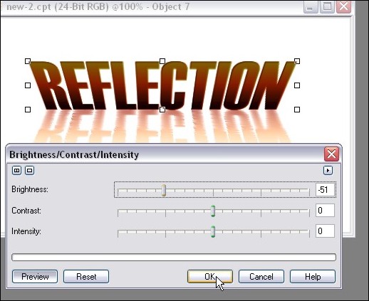
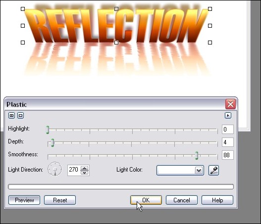
Step 24: One last little tweak just for the heck of it! I want to increase the contrast between the top and bottom of the text that’s being reflected and keep my reflection the same. This theoretically would increase our 3D look even more!
So click on Effects > Texture > Plastic
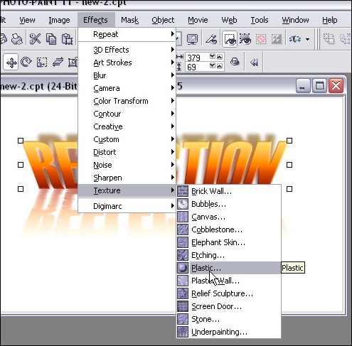
Playing around with the settings will give you LOADS of different looks… here’s what I went with:
And VOILA! Here is our final image!
I hope you enjoyed the tutorial, and please feel free to post comments or questions!
Thanks,
Dan
Please be sure to check out my complete tutorial list for more great articles!
3 thoughts on “Text Reflection – Advanced Text Reflections With A 3d Perspective and Effects in Photopaint!”
Very Nice, I have seen some of these tutorials before but this is by far the best, thanks…
New to Corel and loved this tutorial, easy to follow. I only hope to find many more well done tutorials like this. Great job!
Hey thanks guys 🙂 You can find the rest of my Photopaint tutorials at https://www.danrichard.com/complete-tutorial-list/
Dan