Sheen Text Logo – Create a Text Based Logo with a Gradient Sheen Look, Shadows and a Reflection!
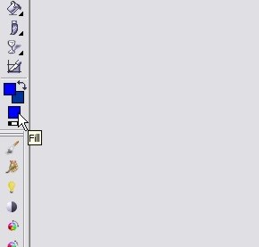
Step 6: If you plan on using this text effect for a wallpaper effect, header or other application that requires you to have a significant portion of the background in view, this is a great little tweak to add. We’re basically going to add a very subtle highlight to the background so the text appears to be every-so-slightly back-lit. Start off by selecting a fill color from your palette that is a brighter version of your current background color. You can see here I chose a brighter shade of blue:
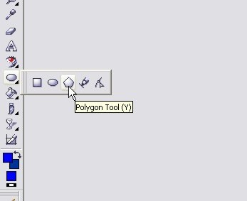
Now select your Polygon Tool by pressing V:
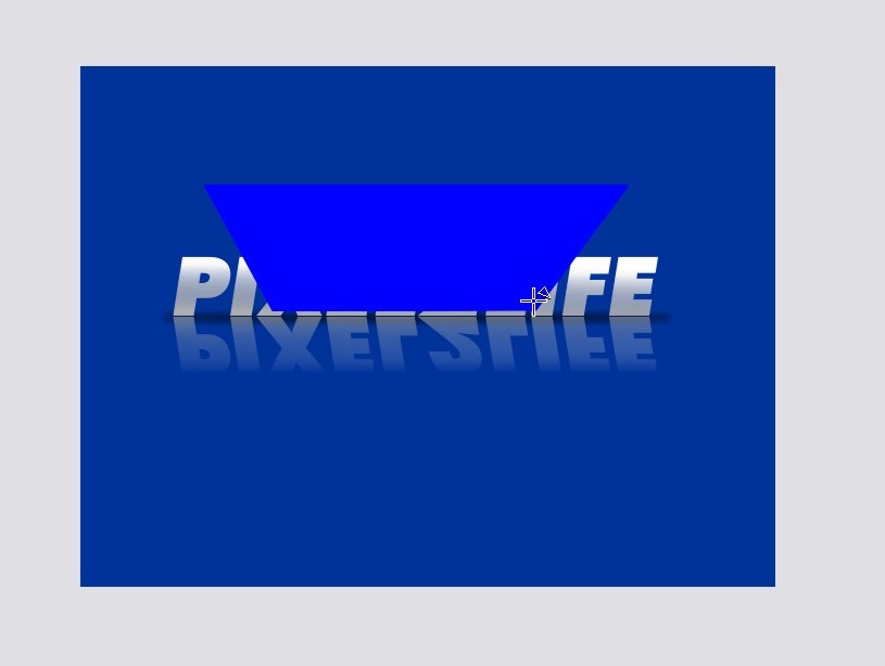
Draw yourself a shape in the approximate shape you would like for your light source… I’m going to use this particular shape because I want the light to expand outwards towards the top of the image:
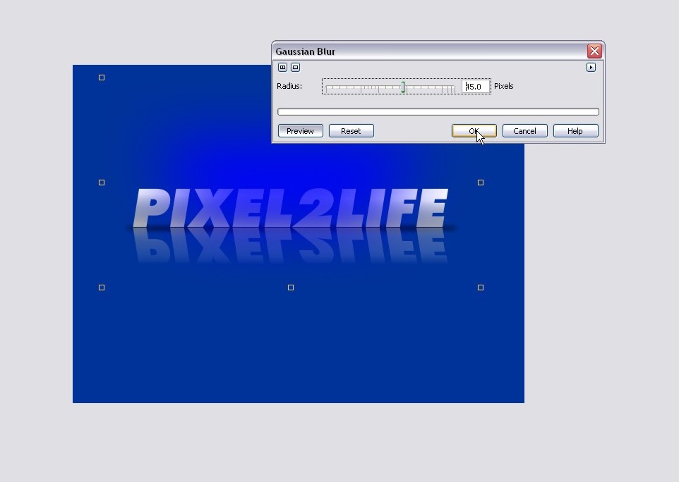
Once you have a shape you like, apply some MAJOR Gaussian blur to it. I went with a pixel radius of 45 on this one:
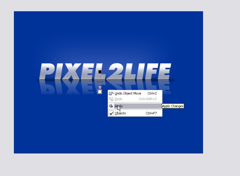
Now go ahead and drag that object to the bottom of the object list on your docker.
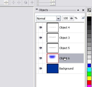
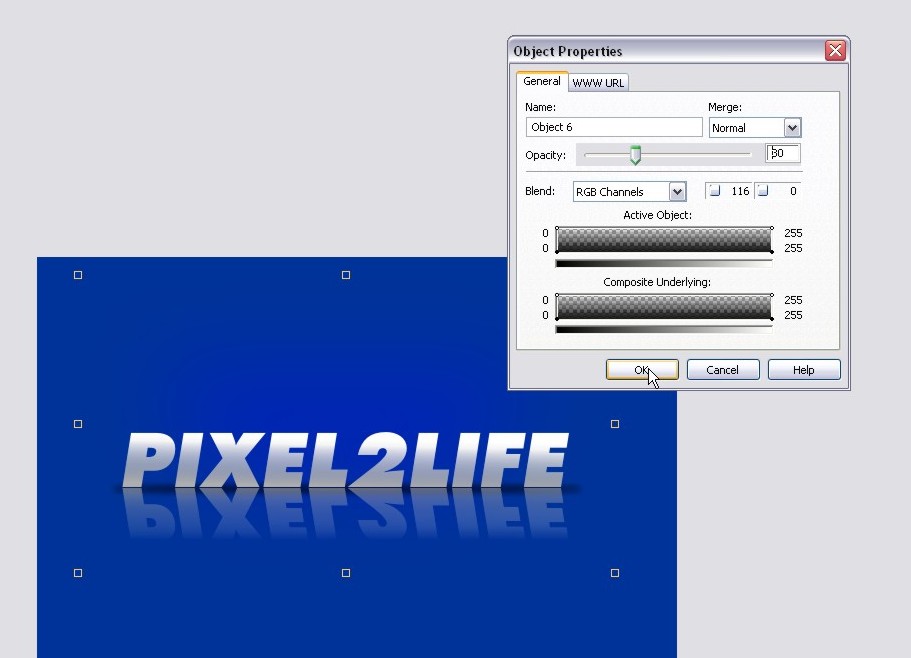
At this point, the highlight is a bit too bright and overpowering, so we’ll tone down it’s opacity to a very low setting to keep things nice and subtle. Right-click the highlight object and click properties to adjust the opacity.
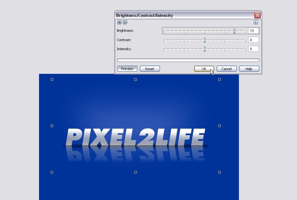
It’s subtle now, but the blue seems a bit too blue and I would prefer a whiter tone to it so it appears more like a light source. For this tutorial, I simply popped open the Brightness/Contrast/Intensity tool and pumped up the brightness to get a whiter tone:
The highlight is a bit too high, so let’s move that down a bit into a better position closer to the text:
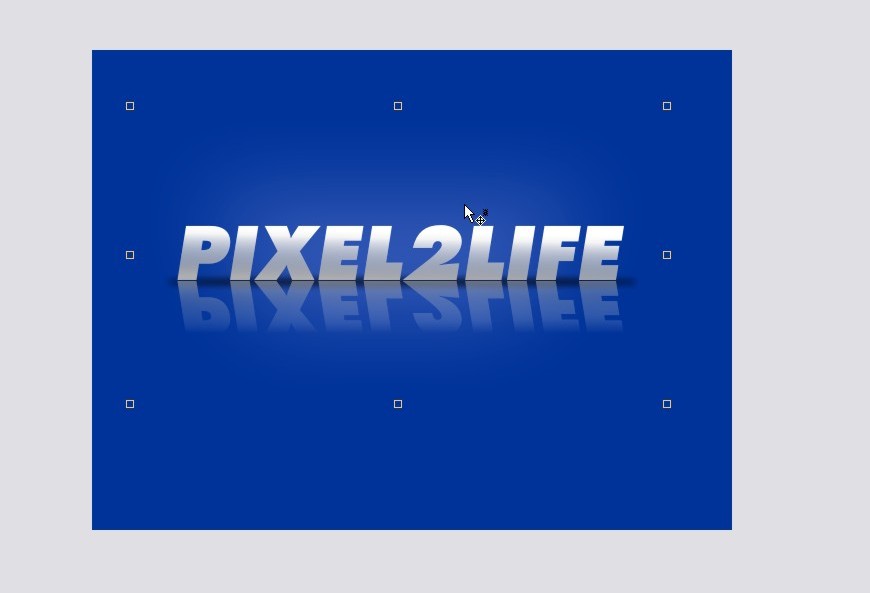
And finally, we want to only have the text to have the backlit effect, not the reflection, so use the Interactive Object Transparency Tool to remove any slight bits of the highlight area from the reflection.
Take a deep breath… we’re done! Crop and add any other elements you want and you’re all set! here’s our completed project:

And here is an example of the text with a very subtle shine added to the text object:

If you don’t know how to create that shine part, check out this page of my Glass Text tutorial that shows you how to create a shine effect step by step.
I hope you enjoyed this tutorial and we’ll see you in the next lesson!
Dan
12 thoughts on “Sheen Text Logo – Create a Text Based Logo with a Gradient Sheen Look, Shadows and a Reflection!”
Another great tut, you should make a website that contains loads of tutorials together, also make it searchable and with its own forum. Call it….erm…….pixel2life maybe, just an idea. 😉
LOL! Good idea!! *gets started*
Dan, you’re probably the only person I [partially] know that produces half-decent Photopaint tutorials. I would have thought you to be a Photoshop person, seeing how established your work (namely P2L) has become on the internet, but you do equally nice work with Photopaint. 😀
P.S. – Why doesn’t your blog have an RSS feed? 😉
Only half-decent? lol! Yes, I am a Corel guy all the way, but there’s really nothing you can’t do in Photoshop that is done almost the same way in Photopaint and vice versa. Many of the menu items are labelled exactly the same actually… just Corel has a few more powerful tools that Photopaint doesn’t have yet not to mention it’s cheaper, but Adobe is American and has a MUCH bigger budget to dominate the graphics market.
I’m sure there’s an RSS feed… I’ll talk to Jamie to get a link up for it 🙂
Thanks for stopping by!
Dan
Great site and resource!
Since I bought Photopaint 11 due to the fact that Corel chose not to develop Picture Publisher (which they bought from Microgrfx) any further I was on the lookout for tutorials.
You are a Corel guy and Picture publisher is still a fav. of mine, I keep coming back using it.
Ever worked with it…?
A German guy Martin Vogler has some awesome tutorials on-line that show the programms potential. To visit
(You might have to use babblefish though)
http://www.martinvogler.de/picturepublisher.html
It didn’t take me long to recreate this tut. in this app. too!
I just feel sorry for this neat program Corel killed, but maybe it was inevitable. Anyway thanks for sharing your insights.
This site keeps me learning a lot which is encouraging!
Just discovered it and will be back.
Best wishes for the coming year!
jim
Hey thanks Jim, I’ll have to check it out. I’ve personally never used or heard of it before. Thanks for he kudos on the site too, it’s very much appreciated and keep me going with new content 🙂
Dan
ahh, not a Corel guy, how is it?
It’s the best once you figure it out 🙂
Hey Dan,
Keep up with the tutorials!! Its 2008, any new ones in mind??? I have corel draw 12, didn’t want to pay for x3! LOL I looking for logos…I have not had a chance to look over all of your tutorials just yet, but headers and logos I need the most. I am totally new to corel paint and draw Rave Trace,etc…and really…its hard to find corel tutorials. Everything out there is photoshop.
Excellent job on this website!
Kelly
Hi Dan ,i use corel but i need some tuts about how to make precious stones with corel can you help me with this ? lol i couldn’t fined any,so please can you do it????
Dan is the best ..
The good thing about Dan’s tutorials and this blog is that it supports all kind of browsers, old and new, and any kind of connection. That’s what a designer is all about. Making considerations for everyone.