Faken goes Fulltime!

Faken goes Fulltime!

The staff knew about this some time ago, but it’s official! I have resigned from the company where I have been working for the last 6 years so that I can work on Pixel2life.com and other web projects FULL TIME! It has long been a dream of mine to run my own business, and today is the first day that it officially becomes true. I will be working very hard on new projects that Jay and I want to bring to life (It’s Hammer Time!) plus update and maintain my current sites a whole lot better. So this is it folks, time to really flex those design muscles 😉

I also want to give a huge shoutout to all the staff, affiliates, members and visitors to P2L for making this dream come true… without you guys, none of this would be happening.

Now, back to work I go before Jay starts yelling at me!

Dan

Want to be a featured SOTW on P2L?

Want to be a featured SOTW on P2L?

Ahh… another rant by Faken! But hey.. it’s my blog, so I can use this spot for whatever I darn well choose right?

Today I am looking to update the SOTW and POTW section and I’m just going through some entries, and it cracks me up just how unprofessional some people are. Folks, if you want your site to make it and actually get somewhere, learn to be polite, professional and informative. There was not one piece of english slang in the very first affiliate application I filled out, let alone the more recent requests I send. With that said, if you want me to post your site as a SOTW (Site of the Week) and hand you several thousand new visitors in just a couple of days, then make the effort to introduce your site properly. I takes me about 10 – 20 minutes to create an icon, write a small review on the site and post it on P2L. Is is too much to ask that you take this time as well to send me a decent email?

An example you ask? Oh you bet! Here is a LIVE sample I just pulled out of my inbox:

Chek diz out! It’s the most hardcore site I’ve ever seen.

Aside from the link they posted (which I never clicked on), this is the entire body of the email. I deleted it without looking at the link.

My delete key is hardcore! The most hardcore keyboard button I’ve ever seen!

Thank you and goodnight 🙂

Faken

Too Cool For IE or too Stupid? Get Over It.

Too Cool For IE or too Stupid? Get Over It.

I was approving tutorials this afternoon and I came across one of those “Too Cool for IE” sites that are cropping up all over the internet, and it just pushed me over the edge and I had to write this article… granted this is more of a rant.

Have people completely lost their minds? Or perhaps some webmasters are getting way too pompous? Personally, I suspect stupidity or perhaps plain ignorance and laziness. Now, before you “Too Cool” people start throwing up your shields, let’s see if you fall under my wrath of blind judgment.

Let’s start from the top! For those of you that have no idea what I am talking about, there is a relatively new movement among the Internet Explorer bashers (The reasons WHY they hate IE are not part of this debate, so spare me) where they are branding their websites “Too Cool for IE”. Here are the folks that started it all: W3Junkies.com

Now don’t get me wrong here folks… there’s nothing wrong with promoting your favorite browsers on your website or letting the world know how you feel about Firefox, Opera, Internet Explorer etc. You have every right to do it. But the practice of FORCING people to download a particular browser to view your website is nothing short of asinine. Let me make this perfectly clear: If you are a webmaster, you are selling services or information (whether you charge or not is irrelevant). The people that view your website are your clients. Who are you to tell your clients how and when to view your site!? It is YOUR job as a webmaster to ensure that your clients can view your website in whatever browser they use in today’s current and common offerings. Especially considering IE still has over 70% browser market share.

Imagine a world where car dealerships dictate to you how to get to the dealer to pick up your car, or McDonalds tells you how to eat their food. Just what I need… a clown over my shoulder telling me how to eat my Big Mac. Have you ever been to a shop that only accepts cash and has no way to process debit or credit cards? I don’t know about you, but I will walk out of that shop and never come back. The excuse of debit “fees” is called the price of doing business. If you design websites, cross-browser compatibility is YOUR “price of doing business”.

Now, I know that W3Junkies.com’s intent of this program is to help promote alternatives to Internet Explorer, which I am totally cool with. Unfortunately there is a wave of webmasters bastardizing the campaign and popping this “Too Cool” logo into their sites because they’re either too lazy or have no idea how to code for cross-browser compatibility. If this is the case, you should NOT be designing and releasing websites. PERIOD. This morning I found a site so poorly coded, that the infamous “Too Cool for IE” banner wasn’t even displaying properly! Are you not embarrassed?! Promoting your favorite browser or bashing a competitor’s browser is no excuse for ignorance and I like, many others, will simply move on to another site and never come back. Cry about the lack of support for CSS in IE all you like, there’s still a way to code your stylesheet so that your site renders properly. Don’t know how? LEARN! Unless of course you don’t want traffic and have no clue how to value customers.

For those of you running the “Too Cool for IE” banner to promote alternatives, but still have a properly coded website with cross-browser compatibility, GREAT JOB! It’s a shame that your example doesn’t reach further. For those of you running the banner because you’re too ignorant or lazy to code a website properly and are forcing clients to change browsers, you should be ashamed. Same for those that are the rampant bashers of IE that simply do it on purpose. Good luck running a business by treating customers that way. You provide a service and visitors are your customers. If you make a service unattainable, your service is useless and you’ve wasted your client’s time and yours. As a webmaster, it is your responsibility to know the basic principals of web design and the business/customer relationship. Good luck succeeding if you do anything less.

And for those of you that are IE junkies and you’re snickering behind your sleeves at this rant, there are “IE only sites” out there that more or less do the exact thing. IE users are plumetting, so you’re just as naive and irresponsible if you think that designing by checking your site in IE only or putting up “IE required” is acceptable.

Now, if you’ll excuse me I’m off to eat my Big Mac. If you see the dude with red hair, tell him to bugger off.. I always eat my fries last.

Dan Richard

Jackpot! P2L to Receive a 1.5 Million Dollar Donation!

Jackpot! P2L to Receive a 1.5 Million Dollar Donation!

Well folks, looks like I get to retire now! The generous Mrs. Hoopla (I swear I am not making this up… it’s from Mrs. Hoopla) because she’s apparently a dying 70 year old who doesn’t want her dirty family to get the money after she kicks the big one. So what is this poor woman to do? Donate it to me of course! Don’t believe me? I have the email to prove it!

Hello,

This offer might be strange, but is the wish of a dying 70 years old woman who now realizes belatedly that there is more to life than mere acquisition of cash{money} and fame. My name is Mrs. Maria Hoopla a widow. My late husband and I perhaps due to our aristocratic background and bad influences lived and never cared for nobody or whose ox was gored, our motto was be rich and famous and the world will be at your feet. I am diabetic and recently diagnosed with terminal lung cancer. The report is obviously not good, several chemotherapy treatments have not helped either and the obvious fact is that I have few days/weeks more on planet earth.

Being childless couple, I inherited all my husband wealth and our relations are no good, as they are waiting patiently for my death to use all our money for illicit and obscene business/things. Before my health deteriorated that I am completely dependant on them for basic necessities I have done charitable ventures within our neighborhoods and beyond and this angered them as they wish to reap from where they did not sow.

Having come to the realizations of what life is all about-caring for others. I have given legal consent and full authority to my attorney-Barrister Ruud Van Boer of Winschoten Consultants based in Amsterdam the Netherlands to immediately disburse all the money to people/charitable homes and the choice of beneficiaries was done by sampling. Your name was luckily picked and I have willed the sum of U.S.D{Ten Million, Five Hundred thousand U.S.D} only to you wish is presently deposited in a security company.

This money should be used STRICTLY for humanitarian/charitable cause. Contact my lawyer immediately who will guide you on the modalities on how you are to visit the security company in Amsterdam the Netherlands for the collection of this money. His e-mail address is ruudvanboer@netscape.net.

Please quote my personal reference number for ease of collection-law/chamber/solicitors/je/ws/WILL/000122 when reaching him by mail, he will give you all the Legal documents to boost the release of the Funds to you.

I plead with you never to deviate from this agreement and I beg of you to pray that my soul rest in peace.

Thanks.
Mrs. Maria Hoopla

How cool is THAT?!

So now Nigerian scamming scum no longer try to scam you with lotteries or account transfers to hold… they just want to flat out donate everything to you. How charming!

Now if you’ll excuse me, I need to call Barrister Ruud Van Boer of Winschoten Consultants to collect my millions from Mrs. Hoopla!

Faken

Advanced Multicolored Glass text in Photopaint!

Advanced Multicolored Glass text in Photopaint!

Jay is going to pass out when he notices I’ve written a fresh Corel tutorial for Twodded, but after a request from a very good friend of mine came through for how I make my multicolor glass text, I decided now would be a good time to freshen up my tutorial writing skills. *snicker* This particular style of text is quite similar to the other shiny effects I’ve used in a couple of tutorials, except I play with a lot of contrasting alterations to create the multiple hues and vibrant colors the text usually has. This isn’t actually very difficult, but it requires a lot of experimentation to find a combo that works with your image.

You see, the entire concept relies on using a single image to create all your multiple hues, so depending on the color/lighting attributes of your image, the settings I use may completely backfire for you. Now now… no need to worry! I’ll walk you through each painful step, and let you know when it’s time to break free of the mold and try different settings to get the right effect. After all, you’re not a lemming are you?

So, here is the effect we’re going to create:
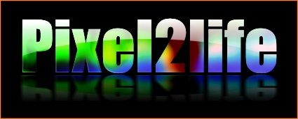
Now don’t let the length of this tutorial fool you… I just like turning simple things into novels. Once you learn this technique and don’t need to read through each step, you should be able to do this in about 5 minutes.

FINAL NOTE: I am assuming you have some basic experience in Corel Photopaint and I do not have to explain some of the simple principals such as what the “Object Docker” is and such… if you’re not sure on some steps, please review some of my older tutorials that cover these basic tools and tricks.

Shall we dance?

Part 1 – Creating the Text Overlay!

First thing we need to do is create our pattern for the text overlay. Basically we’re going to make a blurry colorful object, then slice it into the desired text.

Step 1: Fire up Corel Photopaint and create your new document. For our text, I’ll be using the following settings:
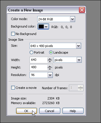
Step 2: Pick an image that you like and paste it all over the place… feel free to just use parts of the image, flip it around, invert it etc… just play around and drop stuff randomly. You can also use various images, so it’s really up to you at this point. I decided to just grab my sig from the P2L forums and dump that around a few times in various positions.
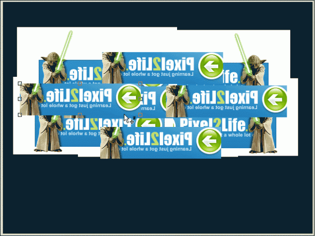
Step 3: Once you’ve got everything pasted the way you like it, select all the objects in your Object Docker and combine them to a single object layer.
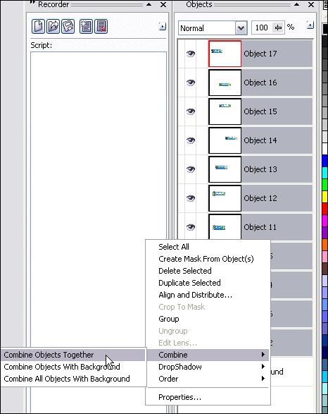
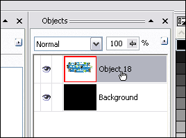
You should now only have 2 object layers… the background and the object with your image(s) pasted in various positions.
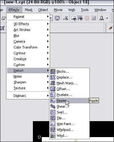
Step 4: Time to distort our text and mess around a bit. I encourage you to try using all kinds of distortion effects and not just follow what I do. You can get all kinds of great results just by trying a few random filters you’ve never played with before! I’ll start off by using the Ripple Effect.
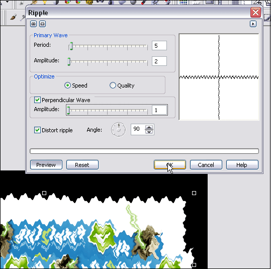
I used the following Ripple settings:
Step 5: Once you’ve distorted the images to your satisfaction (I’m easily pleased), you’ll need to blur it up to get the soft vibrant colors in the text. I’ll use a Gaussian Blur effect for this step.
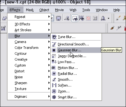
My settings for Gaussian Blur:
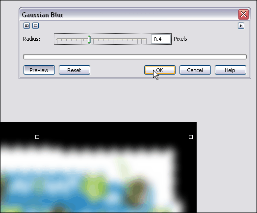
And the final result (Ignore the gif formatting with the poor blending in these screenshots… when you’re working in the program, it should stay nice and smooth for you. I reduced the quality to keep this tutorial down in size):
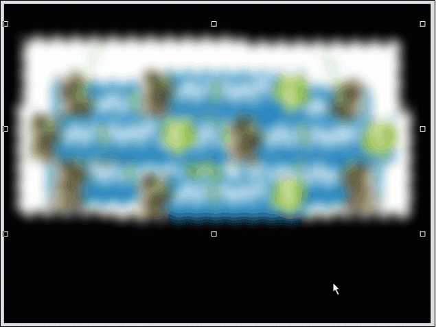
Step 6: Add your text! Select a nice font (Thick fonts are always more effective, but you can use whatever you like) and type out your message. The color you use doesn’t matter in the slightest, so use whatever tickles your fancy. I’m going to use Impact for this one.
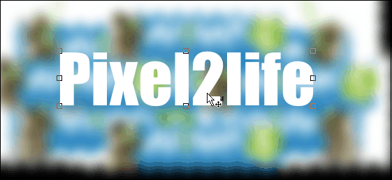
Step 7: Now create a mask around your text.
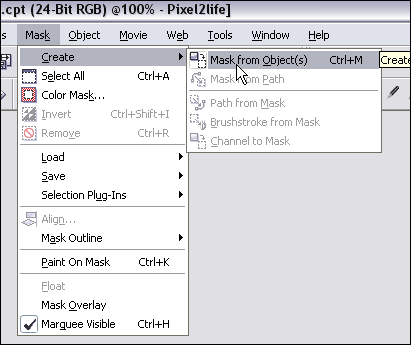
Step 8: Select the blurred image on the object docker… we’re going to cut a piece out of it with the mask we’ve created!
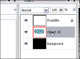
Step 9: Make sure you have the mask tool selected… doesn’t matter which one, but make sure you have it selected instead of the Object Picker. If you don’t, the next steps will have you reaching for the bottle of Tylenol.
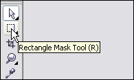
Now hit Ctrl-C then Ctrl-V to Copy/Paste the masked area and POOF! You’ve created some overlay text!
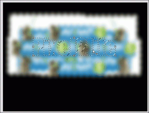
Part 2 – Working the Text!

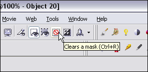
Step 1: Let’s clean up the object docker a bit… we’ve got some goodies we don’t need in there. Start by removing the mask.
 

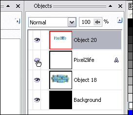
 Then hide the original text object in the Object Docker by clicking on the hide object icon.
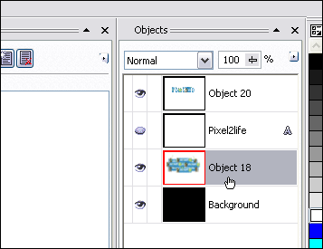
And finally, select the blurred image object and hit delete to remove it.
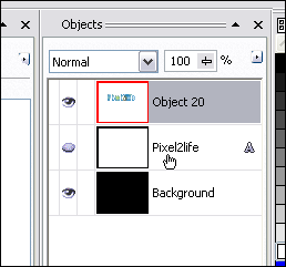
Now you should have a nice tidy Object Docker! Don’t worry… it’ll get real messy in a sec! Just click on the text overlay object and we’re ready for the next step.
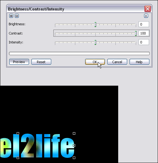
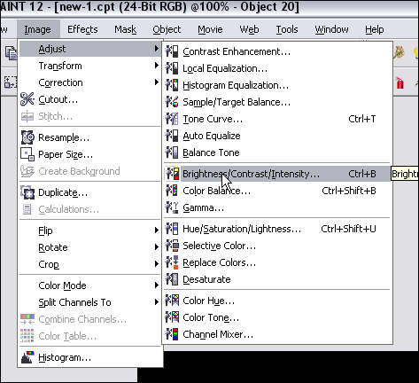
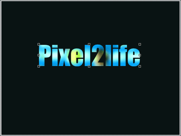
Step 2: We’re going to start off by cranking up the contrast on our overlay text to enhance the color and just brighten the text right up. Now, THIS is where you need to experiment. I suggest cranking up the contrast all the way up, but play around with the Brightness slider until you see something you like. If your image is very dark, I suggest you turn up the brightness quite a bit, apply it, then re-run the tool and increase the contrast. Like I said, you have to play around with this.

So, here’s what I did with my text:
 

This is what I have so far:
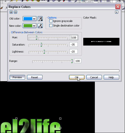
Step 3: Once you have the text the way you like it, hit copy/paste again and make a second copy of your text. Feel free to play with the Brightness and Contrast again, or in my case, I’m going to replace the colors with a green cast. You can also just adjust the hue… works quite well.

Here are the settings I used for the color replace:
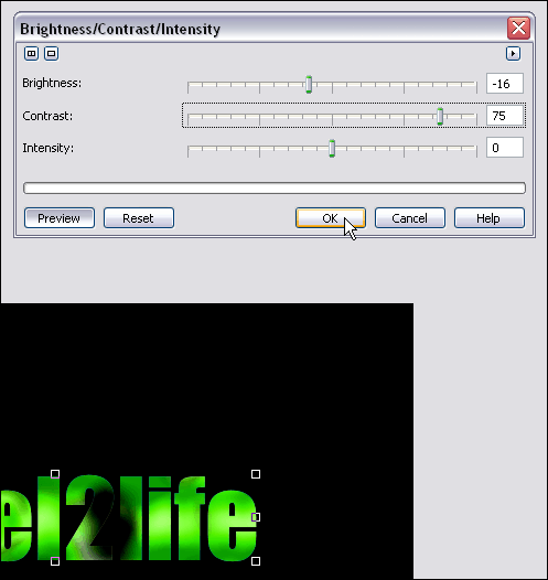
Step 3: I then take my green text and crank up the contrast yet again:
Step 4: Now it’s time to blend our two text objects together and make everything purdy! For those of you that follow my tutorials, you know what time it is! Time to break out the Interactive Object Transparency Tool!

I faded my green text downwards and slightly to the right. Once you have your fade gradient the way you like, apply the settings.
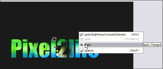
NOTE! If you don’t know how to use the Interactive Object Transparency Tool, I recommend you check out step 7 of THIS tutorial for detailed instructions on how to go about it.

Once you’ve set your transparency gradient, use the object docker to combine the two text objects together.
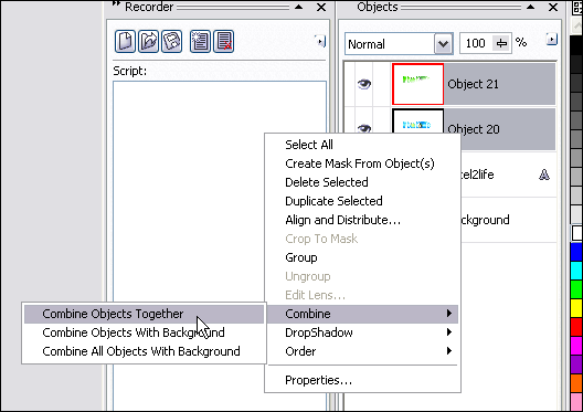
Step 5: Getting close! It’s time to create the “shine” part of our text! Select the text object in the docker and do another copy/paste to create a second object.
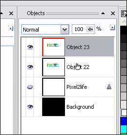
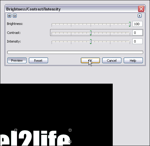
Step 6: Pump the brightness all the way up on this object to make it all white. Make sure the other sliders are set to 0.
Step 7: Using the Ellipse Mask Tool, we’re going to cut out a chunk of the white text for our shine effect. Start by selecting the tool:
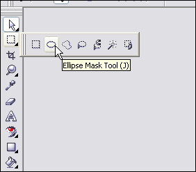
Mask off an area like this:
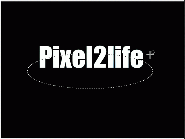
Hit delete to cut out that part of the mask:
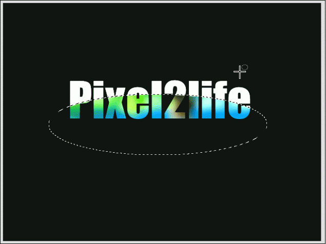
Step 8: Once again, use the Interactive Object Transparency Tool to fade the “shine” part downwards like this:
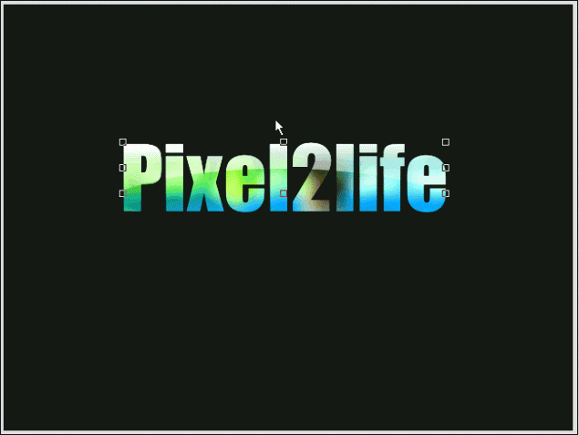
Step 9: Time to play with contrasts and objects again! This is just to tweak the text a bit and get it to a level I like. I’ll start off my clicking on the text object and re-adjusting it’s contrast.
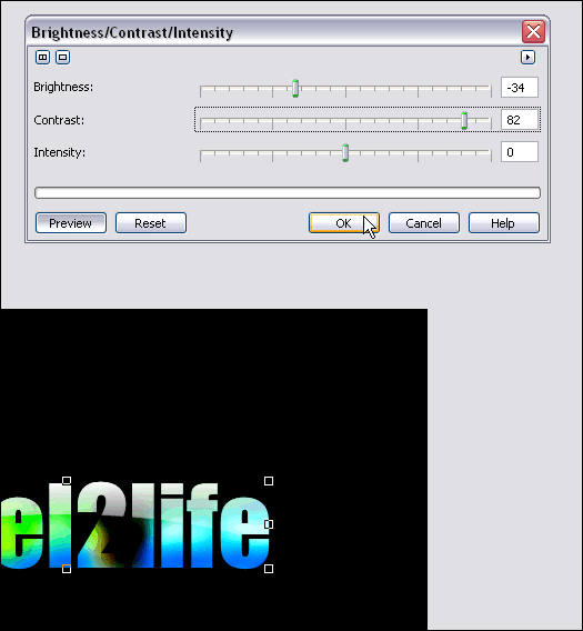
Step 10: Create a second copy of this text by hitting copy/paste again.
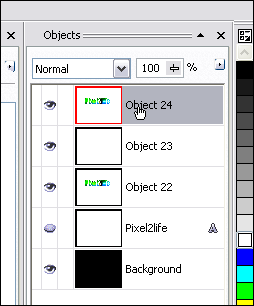
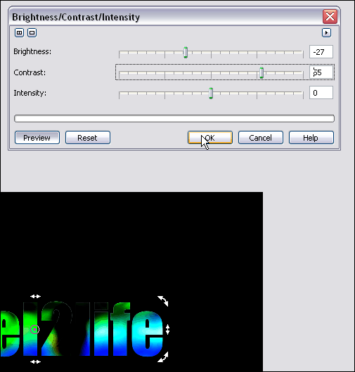
 Step 11: Tweak this object’s contrast… I want to use this to darken up the bottom of the text a bit.
 Step 12: Move this object down one level so the shine is once again visible.
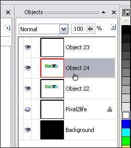
 Step 13: Now this time around, use the Interactive Object Transparency Tool to fade the top layer upwards. This will give your text a brighter upper area and a darker bottom.
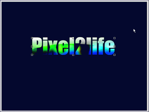
Part 3 – Finishing Touches!

Step 1: Combine all your text objects together and delete any hidden objects you have still in the Object Docker. You should only have 3 objects at this point… the background, the text object and the shine object. Click on the text object and we’ll apply a slight emboss effect to it.
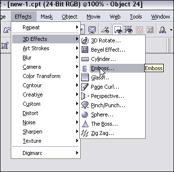
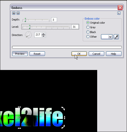
Here’s the settings I used for the emboss:
And we’re done! I added another layer of colored text and added a shine effect (Check out this tutorial to learn how to create a text shine effect) Here’s my final result:

I hope you enjoyed this tutorial and as always, keep experimenting when you draw and have fun! Until next time, have a safe and happy holiday and I’ll see you in 2006!

Dan