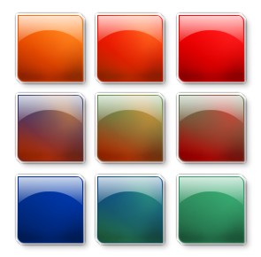
Glass or Shiny Plastic Interface Orb in Photopaint
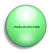
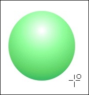
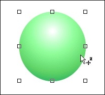
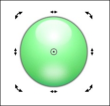
We’ve all seen them! Those glass orbs that I myself am currently addicted to making but for all you Photopaint users, you were sh** out of luck finding a tutorial on how to make them! P2L itself has dozens of orb tutorials for Photoshop, but what about the few and proud Photopaint people?! Well I’ve come to put you out of your misery! Here is how I make my Glass or Shiny Plastic interface orbs in Photopaint! There are tons of variants when doing this, so feel free to play around as you go. Here’s what we’re going to make:
The orb has a number of subtle effects that combine to create the illusion of shiny glass or a plastic surface, so we’ll go through each filter step by step. Lets dance!
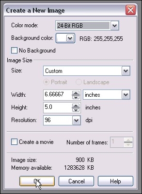
Step 1: Let’s start off by creating a new document. Here are my personal preferences whenever I’m making a new graphic that will be web or screen based. (Create a new document by clicking on File > New or Ctrl-N)
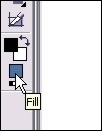
Step 2: Now to create the base gradient color of our Orb. Double-click on the fill color on your toolbox bar to open the Select Fill box.
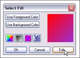
Step 3: Once the Select Fill box opens, click on the gradient button and click edit
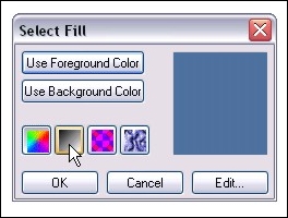
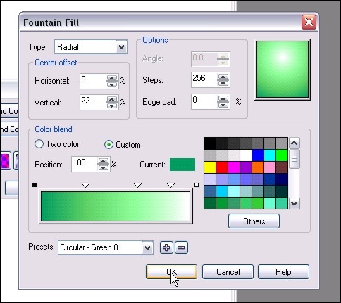
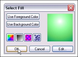
Step 4: Here’s where the fun starts. You can click on the Presets arrow and scroll through a number of preset Circular configurations. For this tutorial, I chose the Green 01 Preset and I set the Horizontal percentage to 0% and set Vertical to 22%. I left the colors default, but you can change any colors by clicking on the arrow just above the color and click on others. The little squares just above the ends of the color blend bar are the start and end colors. You can change those as well by clicking on the box and click Others. You can add additional colors by double-clicking on the square and moving the new arrow into the desired position. The preview box on the top right shows you the changes as they happen. So pick your colors, be sure to use a Radial Type and click OK. This will bring you back to the Select Fill box. Click OK to close it.
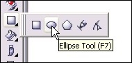
Step 5: Time to draw our orb! Select the Ellipse Tool from the Toolbox bar or simply hit F7.
Step 6: Click and hold the mouse button and drag the mouse over to create the circle. Release when the desired shape is achieved. If you only get an outline or the circle doesn’t appear, be sure to check your shape tool settings and make sure Fill is on and Outline is off.
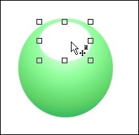
Step 7: Now, change your fill color to white by right-clicking on white on the color palette and draw a second Oval Ellipse on top of the orb. This will be the shine on top of the orb.
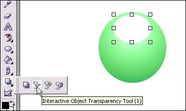
Step 8: From the toolbox bar, select the Interactive Object Transparency Toll (Or type 1)
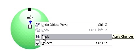
Step 9: Click and hold the mouse button at the top of the shine and drag your mouse to the bottom. Release the mouse button and right-click on the image and select Apply. You will now have the shine effect on your orb. It’s a bit bright for my tastes, so lets tone it down a bit in step 9.
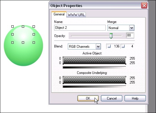
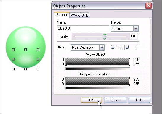
Step 10: Right click on the shine and select Object Properties. Change the opacity to 80 to tone it down just a bit and click OK.
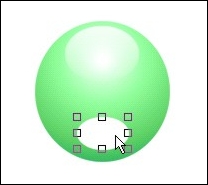
Step 11: Now create another white oval with the Ellipse tool at the bottom of the orb a bit smaller than the oval we created for the shine. This is an optional step that will create the “inner glow” effect on the orb.
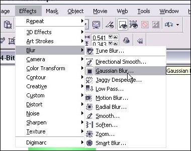
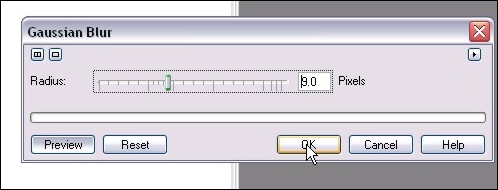
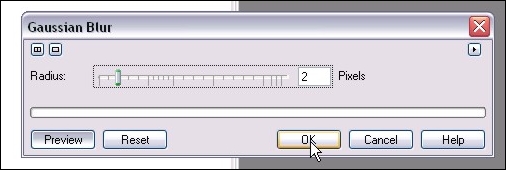
Step 12: Now we apply a Gaussian Blur to the new oval to really blend it into the orb. Here are the settings I used in this tutorial – just click OK when you have it set to what you like.
Step 13: Now right-click on the inner-shadow oval and set that opacity to around 60. We don’t want this too bright or the effect is somewhat lost. Different colors require different opacity, so you’ll have to play around to get it to your liking.
Step 14: Now for the finishing touches. We’ll create a small dark rim around the orb to “sink” it into the page a bit. Click on the main orb to select it with the Object Pick Tool (Type O) and hit Ctrl-C then Ctrl-V to copy/paste a new one on top of the other objects.
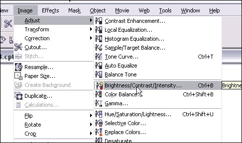
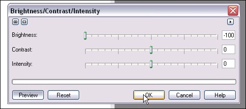
Step 15: Now we want to completely darken the image for our sink in effect. You can do it by either selecting black as your fill tool and bucket fill the object, or as I like to do, click on Image >Adjust > Brightness/Contrast/Intensity (or type Ctrl-B) and turn the brightness all the way down. Just a weird habit I picked up someplace.
Step 17: Now grab the Black Circle object in your Object Docker (You can open the Object Docker by clicking on Window > Dockers > Object Docker) by clicking on the object and holding the mouse button down. Drag it all the way to the bottom of the object list and release. The circle is now under your orb and detailed effects. Do another copy/paste of the black circle and move the second one to the bottom of the list.
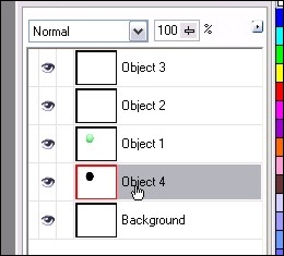
Step 18: Here’s where you should be at so far! Almost done… now let’s add some final details and call it a tutorial 🙂
Step 19: In my final version, I added some text in the center and a simple drop shadow. The drop shadow can be done the same way as Step 11, but just turn down the opacity of that third black circle to about 50 or 60%. Enjoy your orb making!
Thanks!
Dan
Please be sure to check out my complete tutorial list for more great articles!