Browsed by
Category: Tutorials

How to Fix “554 Your access to this mail system has been rejected due to the sending MTA’s poor reputation”.

How to Fix “554 Your access to this mail system has been rejected due to the sending MTA’s poor reputation”.

IP reputation…  when it comes to running servers, especially client hosting servers, server IP reputation is critical to ensure the highest level of service to your clients so they in turn can deal with their clients.  Poor server IP reputation means blocked emails, blacklists, blocked content, firewall issues and all kinds of other nightmares.  It’s especially frustrating because you can be off ALL known blacklists and STILL have a poor IP reputation getting you in trouble.  The bad news is that I’m still struggling with this issue myself… the good news is I can help you with what I’ve learned so far.

As you may or may not know, I run a small hosting company called P2LHosting.com and I recently started leasing a new server for my customers and was assigned an IP that the previous owner had obviously abused, so I inheritied all the blacklists and issues that came along with it.  I didn’t know it at the time since I didn’t have anything running on this box initially, but as I moved clients to the server over the next couple of months, the complaints for rejected emails start rolling in, and thus the nightmare began.  Granted, I could have called up the DC and had the IP changed (and that’s probably what I SHOULD have done), but you know me… I love a challenge!

Here are some of the rejections notices, you’ll probably recognize some of these:

“host smtp.secureserver.net [216.69.186.201]: 554-m1pismtp01-024.prod.mesa1.secureserver.net
554 Your access to this mail system has been rejected due to the sending MTA’s poor reputation. If you believe that this failure is in error, please contact the intended recipient via alternate means.”

“host ecrmdmzmx1.ecrm-online.com [207.54.174.158]:
554 Service unavailable; Client host [darth.pixel2life.com] blocked using Barracuda Reputation;”

“host relay.verizon.net [206.46.232.11]: 571 Email from 67.228.10.58 is currently blocked by Verizon Online’s anti-spam system. The email sender or Email Service Provider may visit http://www.verizon.net/whitelist and request removal of the block.”

“Delay reason: SMTP error from remote mail server after initial connection:
host e.mx.mail.yahoo.com [67.195.168.230]: 421 4.7.0 [TS01] Messages from 67.228.10.58 temporarily deferred due to user complaints – 4.16.55.1; see http://postmaster.yahoo.com/421-ts01.html

Now those are just a few samples, but the one we received the MOST is the “MTA’s poor reputation” version, which is naturally the most difficult to fix.  You see, rejection warnings will normally tell you that you are blacklisted from a specific spam filter list.  So if we look at the examples above, Barracuda, Verizon and Yahoo all have their own blacklists that you can contact and ask for removal if indeed you are NOT sending spam from your server’s IP any more.  So, let’s look at some handy tools you should use to check your IP’s reputation and see if you’re blacklisted anywhere.

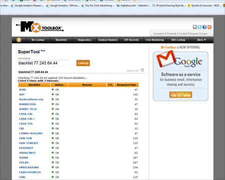
First you’ll want to use MX Toolbox’s SuperTool… a very handy and completely free online tool that allows you to perform many important domain and IP related activities, including check all known blacklists for your IP’s inclusion.  You can find the tool at mxtoolbox.com/SuperTool.aspx and there you will see a complete list of commands and what they do.  In order to run a blacklist check, enter “blacklist: (ip)” (replace (ip) with your server’s IP duh!) and click the lookup button to run the check.  Should you get any positive hits and you ARE indeed blacklisted, they will be listed at the top with a red icon and you can contact them directly and asked to be removed.  A clean bill of health will look like this:
This is where things can get frustrating… you run this blacklist check and you are green across the board, yet you continue to experience those darn MTA reputation warnings!  First off, what the heck does MTA stand for?  MTA is the acronym for Mail Transfer Agent and it’s nothing more than a fancy term for your server that sends out your mail.  So in case you thought MTA was some kind of dedicated Microsoft technology that you can deal with directly, it’s not… it’s just a general term for the hardware doing your email sending.  There are several databases and companies that calculate this reputation, and some ISPs rely on these companies to provide them with tolerance scores to reject possible spam. 

So as an example, if you have 100 ISPs using SpamCop for filtering and you get blacklisted, you can contact SpamCop and have your IP removed.  Now, if you have 100 ISPs using Senderbase reputation ratings and anything rated “poor” is blocked, then you have to contact 100 ISPs, which of course is unrealistic.  You have to improve your reputation, then those 100 ISPs will correct themselves.

Unfortunately these are more difficult to deal with sometimes than a regular blacklist that you can just contact and ask to have your IP taken off.  When it comes to fixing IP reputation scores, it’s very much like performing an SEO tweak and then waiting to see if Google likes what you did.  Let’s look at some IP reputation sites and see how we score.

The first check is with www.sendmail.com and their IP reputation lookup tool located HERE.  Sendmail has been around since the early 80s and according to their company literature, the sendmail Open Source MTA is the most widely used email technology on the Internet with their  Open Source and commercial versions found on over 35 percent of all Internet servers, and deliver over 65 percent of the email messages sent worldwide.  Now when I started this trip in to IP reputation, our lookup page was pretty bad, with our IP in the red and pretty bad looking spam numbers:
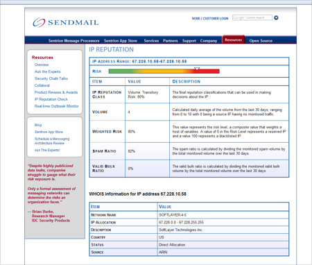
When  you see this kind of information, you clearly have an issue and you’re able to narrow things down because this report is based on the last 30 days of traffic from your server.  So if you’ve owned the IP for the last month or more, you know there is spam coming from your IP under YOUR watch.  So at this point it’s critical to find out where the spam is coming from… if you’re not sending out unsolicited email then either you have a client doing so through their site, your server has been compromised with Malware of some kind or a script on your server is being exploited.  You will need to pour through your mail logs to see where the spam is coming from, it will likely stick out like a sore thumb.  In my case not only was I handed an abused IP, but now I had a client that was getting the “tell a friend” script on his site’s shopping cart exploited.. .the logs showed over 33,000 spam emails were sent from his account!  I did some research and found it was a known exploit (if you run CubeCart, DISABLE the “tell a friend” functionality) and we fixed the issue.

When making changes to your server, it can take up to 30 days for your changes to reflect in your reputation score.  The good news is that with sendmail.com we dropped from an 80% risk to 40% within 48 hours.  Unfortunately this is where a bit of frustration starts to kick… our reputation was now well within acceptable limits and I thought we were all set but we were STILL getting those confounded “554 Your access to this mail system has been rejected due to the sending MTA’s poor reputation” error messages.

So now what?  Further research lead me to Cisco’s Ironport hardware and their IP reputation system that Cisco maintains for spam blocking on their Ironport units.  All this information can be found on their main security network page at www.senderbase.org and you can find the actual reputation check tool right at the top right-hand corner in the “Look up your network” box.  It turns out that the “554” error is in fact the default error message from Ironport units, so in order to fix THAT issue, my senderbase IP score would have to be fixed.  It’s been about 72 hours since canning the exploited cart script and stemming the spam but we’re still rated at “poor”:
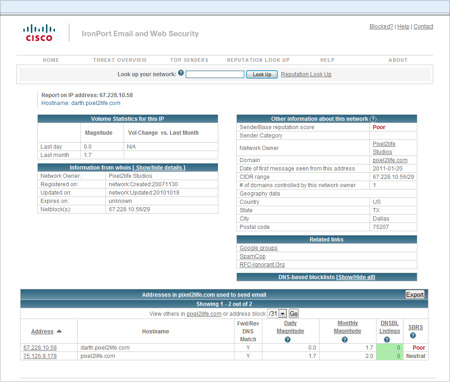
So at this point it’s a waiting game as we see how long it will take for the record to update, but all the research I’ve done so far indicate up to 30 days.  You can see in the screenshot at the bottom right corner that my second server is rated neutral, which is normal.

What else can you do to improve your MTU reputation rating?  Aside from stemming the flow of spam from your server, you can also take some server configuration steps to build up your reputation.  In fact one of the possible factors contributing to a poor reputation is server configuration error.  So you do have to make sure your MX record is in order.  Some other tips:

1. RDNS (reverse DNS) – You need to set RDNS as some mail server check for RDNS settings.

2. Some experts say you should set SPF records for all the domains on the server.  You can find information on SPF records here:
http://www.openspf.org/SPF_Record_Syntax
http://old.openspf.org/dns.html
http://old.openspf.org/wizard.html

3. Ensure that your server is properly hardened, secured and updated to avoid possible exploits that would allow hackers to run spam campaigns through your hardware.

4. Run a malware and rootkit scan on your server.

5. Review your email logs and verify that your server is no longer sending out spam of any kind.

Here are some additional reputation look up tools:

http://www.reputationauthority.org/index.php
http://www.trustedsource.org/

I also found a very interesting post that was made by Hotmail domain support and found some useful tips, check it out:

We have identified that messages from your IP (xx.xxx.xxx.x) are being filtered based on the recommendations of the SmartScreen filter. This is the spam filtering technology developed and operated by Microsoft and is built around the technology of machine learning. It learns to recognize what is and isn’t spam. In short, we filter incoming emails that look like spam. I am not able to go into any specific details about what these filters specifically entail, as this would render them useless.

Furthermore, the deliverability issues on IP were based on negative filter verdicts or other IP reputation issues that caused some (or) all of your mail to be deleted and/or potentially blocked.
E-mails from IPs are filtered based upon a combination of IP reputation and the content of individual emails. The reputation of an IP is influenced by a number of factors. Among these factors, which you as a sender can control, are:

• The IP’s Junk Mail Reporting complaint rate
• The frequency and volume in which email is sent
• The number of spam trap account hits
• The RCPT success rate

Enrolling your IP address to our Junk Mail Reporting Program (JMRP) and instilling an SPF record on your domains, should help avoid common deliverability issues. These programs are in place to help legitimate companies deliver their email messages to Hotmail users. After you have taken steps to enroll in the JMRP and Sender ID, please contact us again so we can assist you further. Please include the SRX number you were given after you complete the enrollment.

Publish/update your SPF records – Please ensure that you have published SPF records for your sending domains and register with Sender ID. You can find additional information and submit your domain for inclusion into the Sender ID program at http://www.microsoft.com/senderID. Please note that technical standards (RFC 4408) discourage use of “PTR” for performance and reliability reasons.
Junk Mail Reporting Program (JMRP) – Enrollment with this free program will benefit you as a sender as it will keep your email lists updated and populated with interested Windows Live Hotmail Customers. This program will help you to remove those Windows Live Hotmail Customers who do not want to receive emails from your company. Please visit HERE!

It is Hotmail’s expectation that complaint rates and spam trap account hits are kept at a minimum. RCPT rates should be as close to perfect as possible. IPs that does not send email on a regular basis with consistent volume is often burdened with poor reputation, as spam attacks are similar in this respect. In addition, IPs that have little to no history of sending email messages to Hotmail users are more likely to be targeted by SmartScreen. There is no hard and fast rule as to email volume and frequency but if the IP is regularly used the likelihood that the IP experiences poor reputation problems diminishes.
Below are additional recommendations that we have for you to prevent being filtered by SmartScreen. These will help you manage the factors that affect your IP’s reputation.

1. Hotmail has created the Smart Network Data Services program. This is a service that helps legitimate email senders work with their customers and partners to reduce spam originating from their IP. To register, please go to http://postmaster.msn.com/snds/. This program allows a sender to monitor the ‘health’ of their IPs.

2. Ensure that there is not anything technically wrong with your MTA. Some of the questions that you need to keep in mind are:

a. Are your DNS records updated?
b. Are you transmitting data upon making the SMTP connection?
c. Is the problem isolated to any specific machines?
d. Do your SMTP logs show any failures?

3. Segment your mailing infrastructure by IP. Marketing email, transactional corporate email, “forward to a friend” email and signup emails should be sent from different IPs. This will help to identify what types of messages are being flagged by Hotmail users.

4. Strengthen the sign up process. Confirm that you are using a double-opt-in sign up process. This will not help in removing existing Hotmail customers from your email lists but it will confirm the authenticity of those who sign-up on for your email campaigns and newsletters.

5. If you have any feedback loops setup with other ISPs, you should look for trends to try and determine possible causes like a new data source or a new advertisement. It may also be that customers signing up do not recognize the mail you are sending them.

6. Clearly mark your emails so that Hotmail customers are able to identify quickly and easily that they requested emails from your service.

7. Do some analysis on the data regarding complaints. Look at Hotmail users who have never clicked, opened, responded or bounced in any way. These poor performers could contain many bad addresses.

8. Evaluate the frequency of your mailings. Are you making your mailings less relevant and welcome by sending too many emails?

9. Enroll in the Sender Score program. This is the only white list that Hotmail uses. It is owned and operated by Return Path. You can find information about this program at http://www.senderscorecertified.com
10. Visit http://www.senderbase.org to verify that your IP is not being listed on any third party block lists.
11. You can also take advantage of the following email delivery consulting companies who participate in the Messaging Anti-Abuse Working Group (http://www.maawg.org/home/), and the Authentication and Online Trust Alliance (https://www.aotalliance.org/index.html).
The information that we have provided are only recommendations. Microsoft makes no guarantees that following these steps will guarantee deliverability to MSN, Windows Live Hotmail, or Live.com customers. If you believe that you have taken advantage of the recommendations above and believe that you have built a strong IP reputation and still encounter problems sending to Hotmail users, please don’t hesitate to let us know and we’ll see what we can do to assist you further.

So now that I have made all the recommended changes (and HOURS of research) I am hoping this will do the trick.  I will keep an eye out on the reputation status of my IPs and update this posting as results start to come in, and I will add additional information and tips as I find them.  I hope this helps you figure out how to deal with your own IP reputation issues!  Please feel free to click on the comment icon below to comment on this article or to share your own tips or experiences dealing with this  issue.

Thanks,
Dan
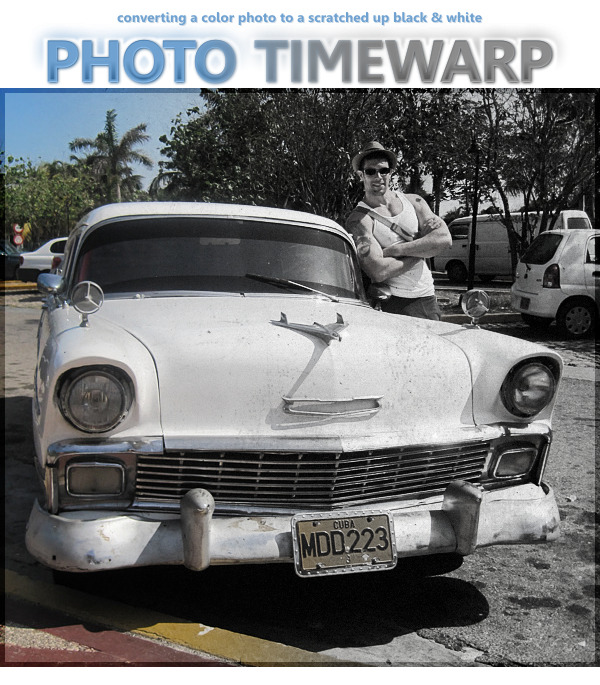
Converting a color photo to a scratchy black and white or sepia in Corel Photopaint!

Converting a color photo to a scratchy black and white or sepia in Corel Photopaint!

Why hello there boys and girls, I hope everyone has been behaving themselves seeing as it’s been MONTHS since I’ve been able to sit down and throw together a tutorial for you. I apologize for the huge absence, but as most of you probably know, I have been going through some fairly massive life-changes so things have been a wee bit hectic. BUT I am happy to say that things are calming down and my work routine should be coming back to normal. With that said, here’s a small tutorial I wrote today based on a request from one of my Facebook friends asking about a photo I posted from my recent trip to Cuba.

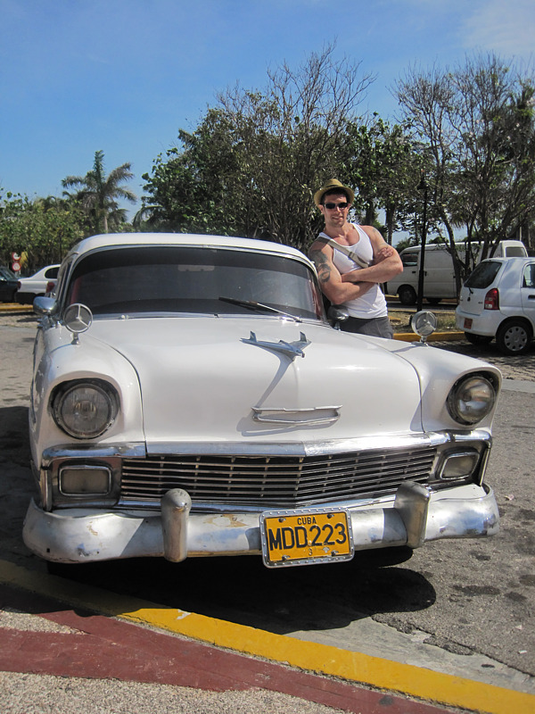
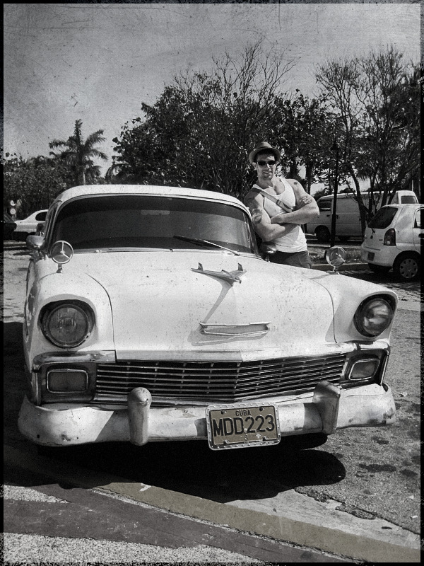
If you’ve never been to Cuba or seen photos from other friends and whatnot, Cuba is basically frozen in time with LOADS of items such as cars, furniture, tools and much more from the 40s, 50s and 60s. In fact, you will see perhaps 4 cars from the 1950s for each car you see manufactured in the last 10 years or so… needless to say, this is heaven for a classic car lover like me! While walking around one of the markets, my girlfriend snapped a shot of me standing next to a 1955 Chevy and we both noticed that this pic could easily be an original black and white from the 50s. So, I promised her I would make it look like an old photo for our album and I posted it on FB for my friends to check out. Here’s how I did it in about 5 minutes.

Here’s the original photo we’re going to start with:

And here’s what we’re going to end up with at the end of the tutorial:


Before we get too far in to it, I’m going to assume you are now familiar working in Corel Photopaint. If you’re not sure how to use Objects and other basic functions, please check out my older tutorials, which cover the basics in greater detail.

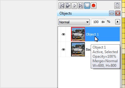
Step 1 – First thing we need to do is create a duplicate layer of the photo… so just do a simple copy/paste and duplicate the layer.

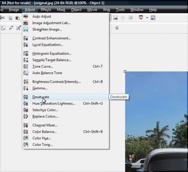
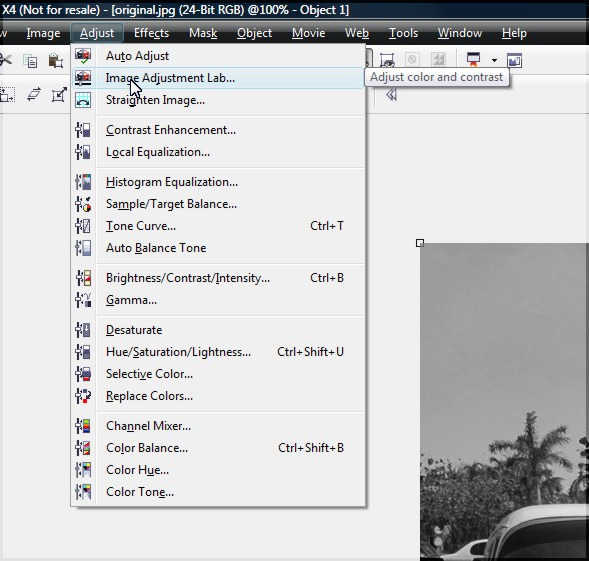
Step 2 – Click on the new object layer and desaturate the layer… you do this by clicking on Adjust > Desaturate. Your photo will now appear in greyscale.

Step 3 – After running the desaturate function, the photo will be stripped of the depth the color gives it, making the photo appear a bit bland and lacking highlights and shadows. We’re going to punch this up a bit by playing with the contrast. In my older tutorials, I used to use the contrast/brightness/intensity function, but I have lately been using the more powerful Image Adjustment Lab, which you can access by clicking on Adjust > Image Adjustment Lab.


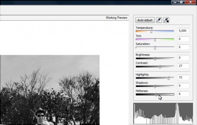
Step 4 – The Image Adjustment Lab allows you to controla variety of adjustments you can perform on the photo, including the saturation, overall brightness and contrast, as well as boost highlights, shadows and midtones. First thing I like to do is pump up the contrast, then I adjust the highlights and midtones to a level that appeals to me. You can see the adjustments I made below:


Once you’re happy with the look of your photo, click OK to apply the changes and return to the main edito screen.

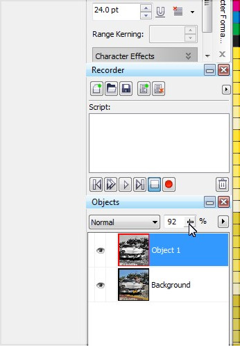
Step 5 – Before we merge the object layer with the background layer, there’s one more little trick I like to do, and that’s add just a pinch of color to the photo… you want just a little smidge though, something barely noticeable. You do this easily by simply reducing the opacity by a fraction on the main object layer. I dial it down to 92% for the level I like:


At this point, we no longer need to keep the layers seperate, so go ahead and merge them and we’ll move on to the next step.

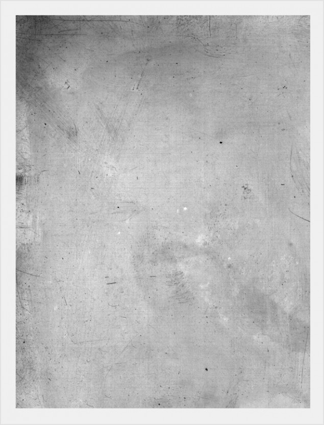
Step 6 – Time to mess up our photo and give it some age. I quickly did an image search for scratched photo textures and found this beauty by Jeremy Brotherton on his Deviant Art page (click here).  Just paste this right on top of the photo.

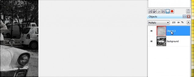
Step 7 – After you’ve slapped a texture on top of your photo, set the object layer type to “multiply” and you’ll start to see the magic happening! Of course we’ll need to adjust the texture a bit, so let’s tweak it to where we want it to be…

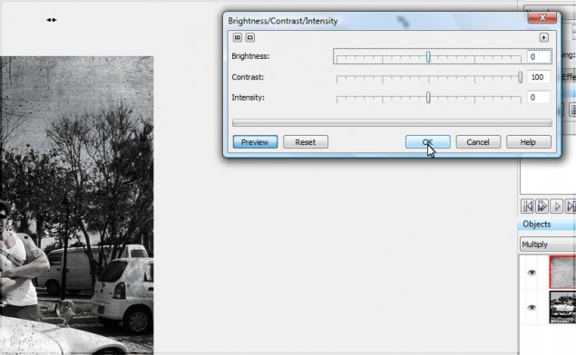
I want to pump up the highlights of the texture so it doesn’t darken the photo up too much. We can do this easily by pumping the contrast up to the max:

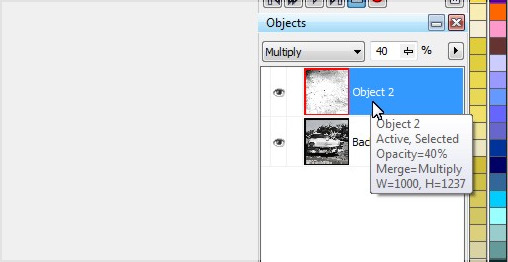
The texture will still be a little too intense, so I tone that down by reducing the opacity to 40% or so. The texture looks good, but it’s not quite scratchy enough for me, so we’ll build that effect up a bit more.

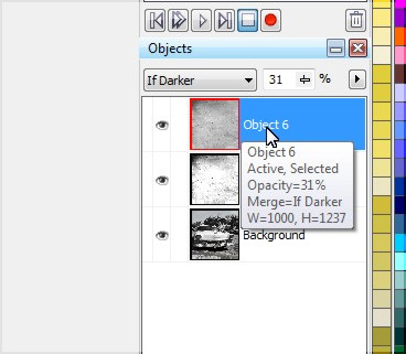
Step 8 – I want more scratches in the photo, so paste another layer of the texture and set that layer to “If Darker” and reduce opacity to 30ish% and the scratches should now look pretty convincing and realistic.

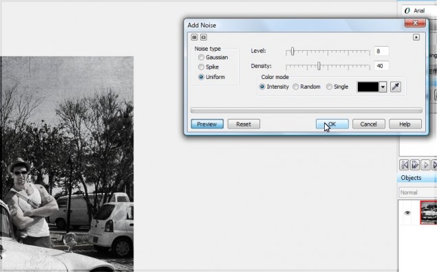
Step 9 – One more step… the photo looks great, but it’s a little too clear for an old photo. We can dirty up slightly by adding a tiny bit of noise. Hit the noise filter by clicking on Effects > Noise > Add Noise.

And we’re done! Here’s our final result straight out of the 50s and ready for your album:

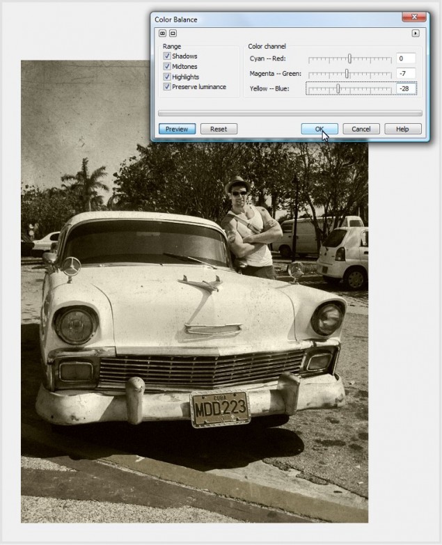
Would you prefer Sepia? Adding a Sepia effect to this end result is one step away, and VERY easy. Just click on Adjust > Color Balance and tweak the yellow and magenta sliders like so:

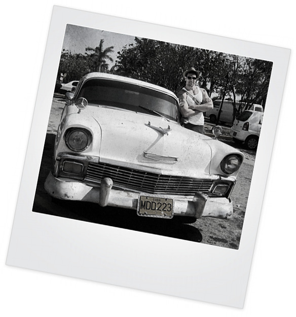
You can also drop the photo in to a Polaroid template (There are dozens of these available on Deviant Art):

Thanks for reading, please make sure to share this tutorial or comment using the tools below!
Dan
Making Sense of the DPI Equation – A Follow-Up

Making Sense of the DPI Equation – A Follow-Up

Hey all! One of my most popular articles/tutorials is a rather large write-up on the difference between DPI and screen resolution because it seems like almost everyone is a a little confused on what the two mean and how they affect each other (or rather how they DON’T). The tutorial was called “Learn how to use the right DPI for Printing or On-Screen Graphics – Making Sense of the DPI Equation” and you can check it out by clicking HERE.

A TON of you have posted comments and questions and added more information on this article and I thank you all for your contributions! Recently I received an email from a fellow designer named Steven and he was a little confused about the tutorial and had a question regarding how to apply this article to his current project of printing our business cards. I thought it was a great question and one that I have received many times in one form or another, so I thought I would share it on here for anyone else that was having a similar issue. Here is the original email I received:

I loved your tutorial at 13dots.com about dpi and printing. Truthfully, you seem far more patient and methodical that many others on the net, many thanks.


*Dan blushes furiously*
I followed the links to Danrichard.com. There was one important piece of info that I felt was missing, and that’s why I’m writing.

What program works well for downsizing for print? My photos are at 2048×1536 at 72dpi. Because of you, I understand that the dpi is essential here. I want to print these in business card sizes, without losing detail. So I’m thinking 300 dpi (likely the max of the colour commercial laser printer I’ll be using) is my goal. 300x2in (height) is 600dots vertical by 900 dots horizontal…(hmm that doesn’t seem to help me, please disregard). What program (open source would be best, like gimp) will reduce to 3″x2″ at 300 dpi? I’ve spent the last 8 hours trying to do this, using gimp, browsing so many tutuorials, etc. My images look so blocky and lose so much detail.

Many sites said to use photoshop (Image> Image Size menu. Click on Resample Image and choose Bicubic Sharper from the drop-down menu). Is that the only way? I’m so trying to stay open source.


Legit question right? Here’s my windy answer…

The first thing you need to let go of is the screen resolution vs DPI, it’s meaningless. So if your native digital image is 2048 x 1536, then that is it’s screen size no matter what the DPI is… DPI is for printing, it has no bearing on screen size. So if an image is 2048 x 1536, then it will be that size no matter what the DPI happens to be when measuring it for printing in inches or CMs for example. So, now, what you want to do is calculate how big your native digital images needs to be in pixels to achieve a 3 x 2 inch image at 300 DPI.
By the way, first let’s see how big this image is at 72 DPI in inches, the math is very easy:

2048 pixels / 72 DPI = 28.44 inches wide
1356 pixels / 72 DPI = 18.83 inches tall

If you do the same thing with 300 DPI, then the image would print out to this size:

2048 pixels / 300 DPI = 6.83 inches wide
1356 pixels / 300 DPI = 4.52 inches tall

So, this means that if you were to print out this image in its native resolution, you would end up with an image 28.44″ x 18.83″.

The question is, how big does it have to be in pixels to be equal to a 300 DPI 3″ x 2″ image. So now we do the reverse:

3 inches x 300 DPI = 900 pixels
2 inches x 300 DPI = 600 pixels

So your image on your screen would be 900 x 600 pixels and when you print it out, you either set the image to 3″ x 2″ at 300 DPI or simply set force the image to print at 3″ x 2″ and it will automatically work at 300DPI. Do you understand what I mean by the difference of DPI for printing vs on your screen? The image on your screen is 900 x 600 no matter WHAT you set the DPI too. The only time DPI matters is when you go to print!

Now, on the other hand, your native image is a lot bigger than 900 x 600, so it would be a shame to limit yourself to 300DPI, why not go to 600DPI? If you do that, then you simply double the pixel count to 1800 x 1200 and if you print that out in 600 DPI, you would get a 3″ x 2″ print out.

You can easily do this with Gimp or any other program 🙂 Just do a regular resample or resize to whatever size you need and you should be fine.

I hope this makes sense!
Dan


So basically, you don’t need any fancy filters or effects to do this… just do a regular image resize to the proper pixel size and it’s done. I mean really, you could even do this with MS Paint! Then from there depending on the program you are using, you either set the image from within the software to 3″ x 2″ at 300 or 600 DPI and print directly, or if the open source application does not allow you to do that, use the printer settings directly to force the image to the size you want in inches and the DPI will be automatically adjusted.

Hope that helps guys!
Dan

New Tutorial – Create Amazing Grunge Textured Wallpaper Artwork with GoMedia Vector Packs!

New Tutorial – Create Amazing Grunge Textured Wallpaper Artwork with GoMedia Vector Packs!

Hello everyone!  Today I am going to show you how to put together a pretty badass looking grungy wallpaper background without having to go nuts with brushes and filters… we’re going to use nothing but the EXTREMELY cool Go Media Arsenal Vector Packs, and some object layer styles.  I’ve been seeing people use these gorgeous vector packs and we advertise them on Pixel2life.com, but I’ve never had the chance to play with them until I recently picked up Arsenal Pack 12.  If you have no idea what I am talking about, a company who makes some fairly insane artwork for guys like Ozzy Osbourne, Pepsi, Metallica and a ton of other very high profile names.  GoMedia also sells gorgeous artwork, templates, textures and more in their custom shop, known and the GoMedia Arsenal Shop, and one of their biggest sellers are the Vector Packs.  As I write this, they currently have 13 sets, with a 14th on the way fairly soon.

If you want to check out all their packs and other design goodies, check them out at www.gomedia.us and you’ll find plenty of gorgeous artwork to drool over.  The beauty of these packs is that they are all vector EPS files, so you can work with them in any graphics program, including Corel products, and I am going to show you how these packs make it so simple to create killer pieces in a matter of minutes.  In fact, the piece that I did for this tutorial took about 5 minutes to make tops, it’s honestly that simple!

WARNING: For this tutorial, I am going to be using the Line Work 2 set and East Asian Folkart set from Pack 12, as well as Watercolor Textures 1 from their Textures series.  You can see the Pack 12 as well as the other Packs by clicking HERE and you can check out the Texture Series by clicking HERE.

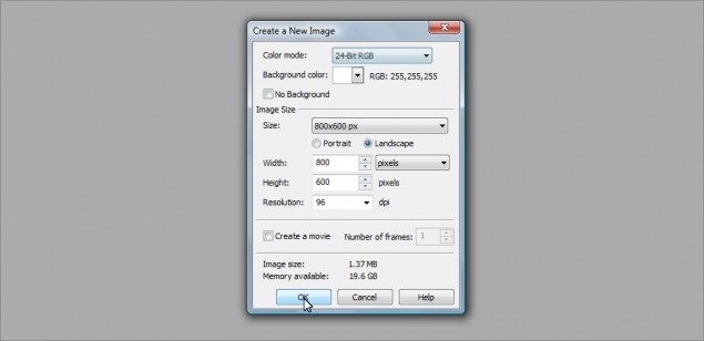
Step 1: Shall we begin?  Let’s start off with an 800 x 600 pixel image, doesn’t matter what we use for a background color…  I went with white:

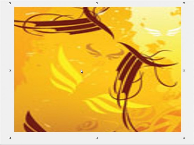
Step 2: The first thing we want to do is establish a base background, and one of the easiest ways to do this is grab an image, ANY image and slice a colorful part of it up and stretch it right out to cover the entire size of our background.  For this tutorial, I’m going to just grab a  thumbnail of a product box right off the GoMedia website… Looks like the Wings Set is the lucky winner:

Step 3: I only want to keep the nice yellow and indian-red colored lines, so I’ll just use the rectangle mask tool and cut away the extra bits I don’t want from the sides, top and bottom… once I’m done chopping that all off, I’m left with a nice little image ready for a good stretch:

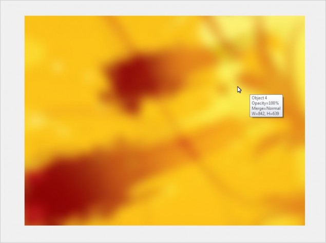
Step 4: Now all I do is drag the transform points on the object (Those little squares on each corner and the sides of the object) until my background is completely covered, and then I’ll go ahead and blue it to soften up the lines and distortion.  I went with a 25 pixel gaussian blur on this one:

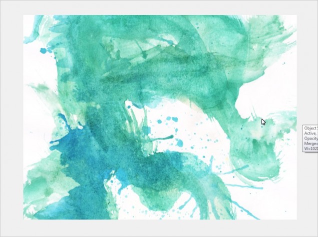
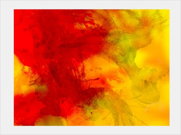
Step 5: ALRIIIIIIIIIIIIIIIIIIIIIGHTY THEN!  The foundation of our background is in place, it’s time to start adding some textures and make some magic!  Let’s start with some watercolor textures from the GoMedia Watercolor Textures pack, starting with a nice blue and green one.  I just paste this right over top of my yellow background and resized it until I found a look I liked:

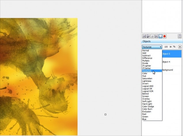
Step 6: Now comes the fun part… clik on the object in the object docker and then start scrolling through the object layer styles and you’ll find all kinds of cool looking effects with the click of a single button!  It’s amazing how much easier you can create really sweet digital artwork like wallpapers and collages by simply learning to fiddle around with the layer styles.  So with this watercolor texture, I decided to go with the Texturize style:

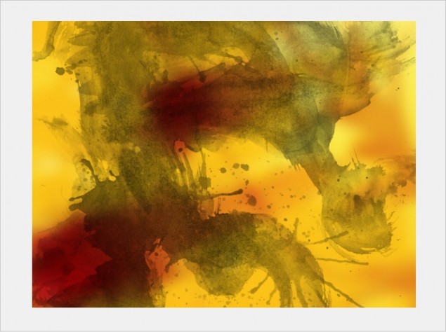
Here’s how it looks:

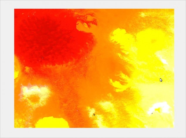
Step 7: Next up I want to add more dramatic coloration to the piece, something like bright blood red or a similar tone… I found this sweet watercolor texture and pasted it right on top:

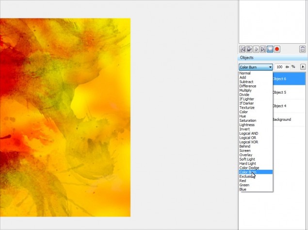
Step 8: Once again I played around with the layer styles for this texture and found that the Color Burn style looked really cool:

This is starting to look pretty cool… see how easy this is?!

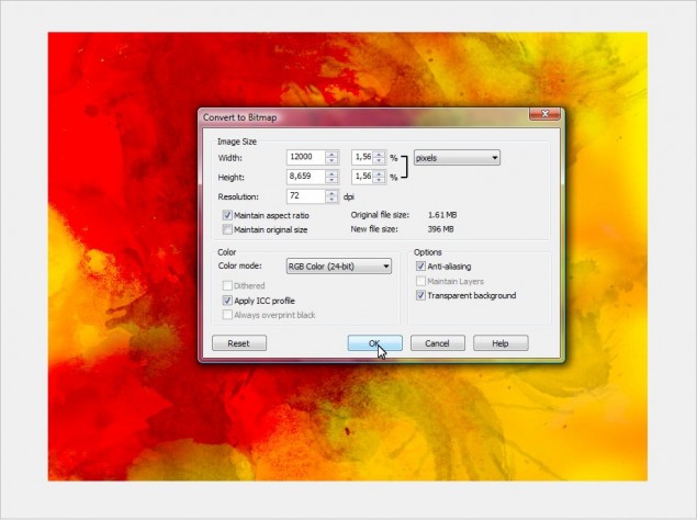
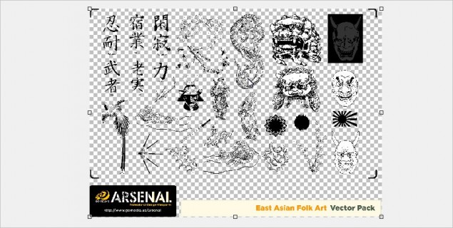
Step 9: OK, time to get down to serious business, let’s start working with the GoMedia Vector Packs… when you purchase one of these packs, each set is actually an EPS image file, so you will need to import this in to Photopaint and tell the program how big you want the images to be.  Photopaint is not a vector application, so it needs to convert the EPS to a raster graphic.  I’m going to start with the Line Work 2 set, so I go ahead and open the file with Photopaint and I am presented with the following box:

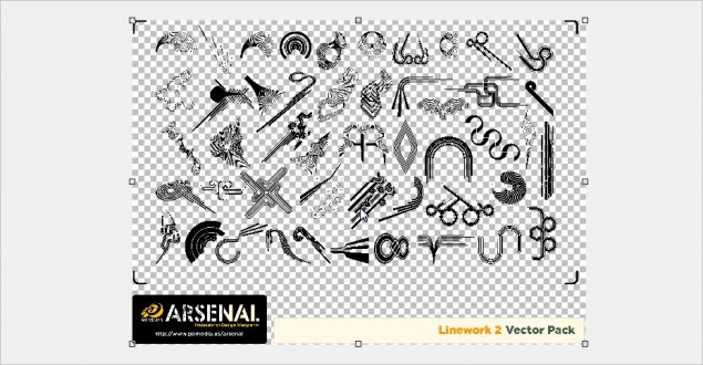
Step 10: The default size is way too small, so I always boost up the size of the image… for large wallpapers the like, I go with 10,000 – 12,000 pixels wide at least.  It depends on how many images are in the pack, so you have to mess around until you find a size that is the correct size for you to work in.  Remember it’s always better to have an image that’s too big, rather than not big enough!  So let’s go with 12,000 pixels and click OK.  The EPS file will now open and you will see all the images that are in the set on an object layer separate from the background:

WARNING: Resizing your EPS file when you initially open it requires a lot of processing, so bear in mind that the bigger you make the image, the longer it takes to open.  On my Quad-Core Intel with 8BG of RAM, opening the Line Work 2 EPS file and converting it to a 12,000 pixel raster image takes about 8 – 10 seconds.  So large resolutions on older machines could take a little bit.

Step 11: I’ll go ahead and zoom in a bit and select one of the images in the set that I want to use in my wallpaper.  You can use a masking tool to select the image you want, in this case I’ll mask off this nifty shape using the Freehand Mask Tool:

Step 12: Once I have it masked off, I simply hit Ctrl-C to copy the selection to clipboard, go back to my wallpaper project and paste it using Ctrl-V in to my project:

Step 13: It’s a tad too huge, so I’ll go ahead and resize it until it fits in nicely:

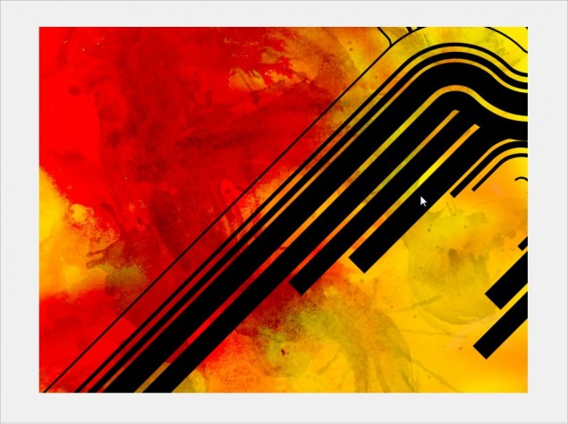
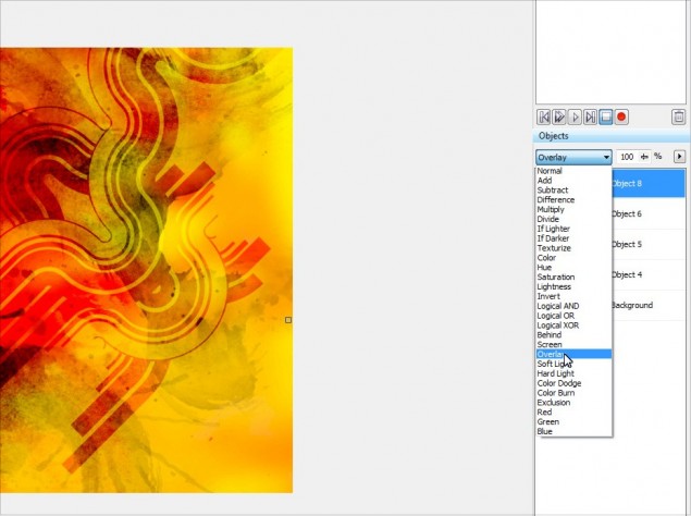
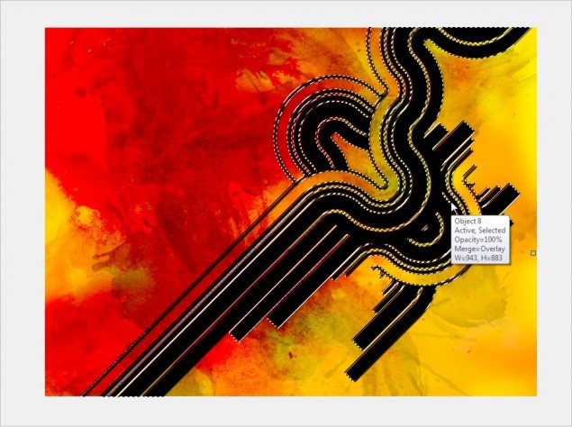
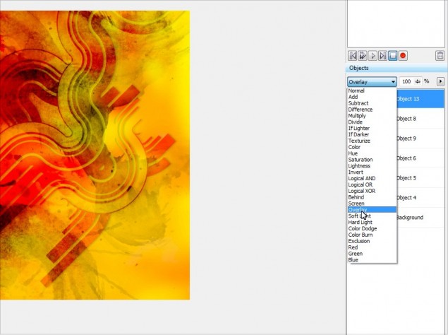
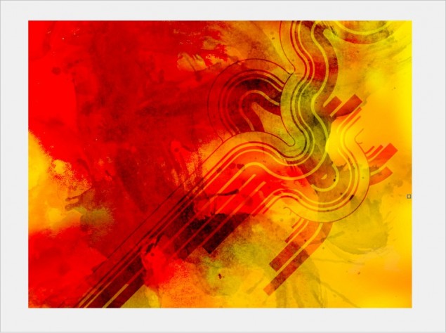
Step 14: Once again, we can play with the object layer styles to find a cool effect to apply to our nifty little line shape… in this case, I decided to go with Overlay, it blends in very nicely with the rest of the textures:

Step 15: I’ll go ahead and add a little drop shadow to the shape we added, just to make it pop out a little bit more and add a slight 3Dish element to the wallpaper.  It’s a little tricky with layer styles though because you can’t just shove a blurred dark shape under the object that you want to have the drop shadow on due to the fact that the layer style is forcing the object to interact with whatever is under it.  To correct this problem, we’ll need to mask off the shadow layer at cut away anything that isn’t part of our “shadow”.  You’ll see exactly what I mean in the next few steps, it’s not really that hard to understand once you see what I am talking about.

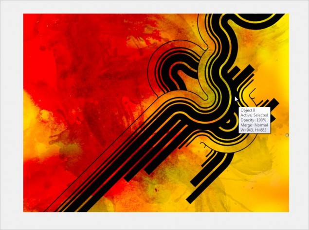
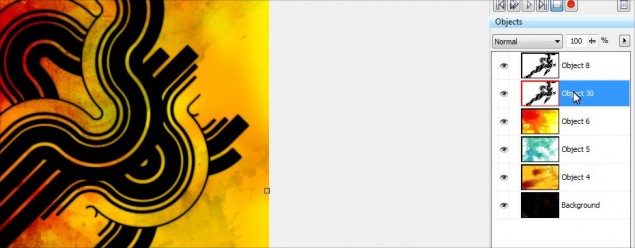
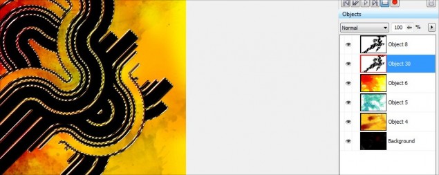
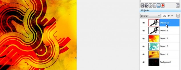
Start off by copy/pasting an additional copy of our line object… just click on the line object, hit Ctrl-C and then Ctrl-V and you will now have 2 copies in your object docker like this:

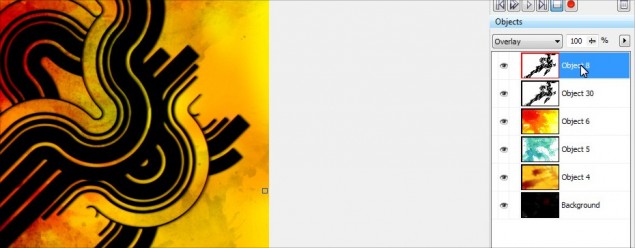
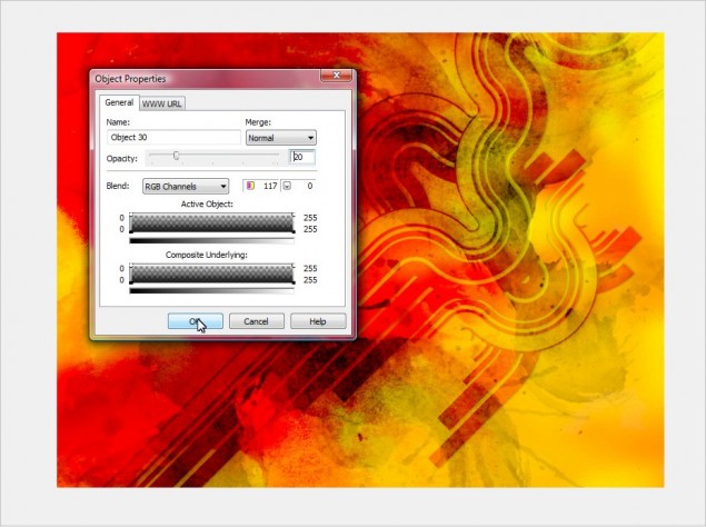
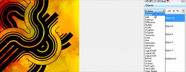
Step 16: So if we look at the object docker, Object 30 will be our “shadow” object and Object 8 is our original line shape that has the nice overlay effect.  The first thing we need to do is change Object 30’s layer style to Normal instead of Overlay, so go ahead and click on Object 30 in the docker and then set the layer style to Normal:

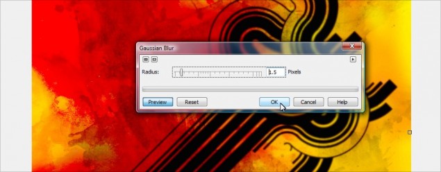
Step 17: Next up, apply a Guassian Blur effect to the shadow object layer, I’ll go with a 1.5 pixel spread (The bigger the image, the bigger you should blur it):

Step 18: We’ll need to move the shadow a bit so it shows up inder the main line image, so just click on it and move it over a couple of pixels and I will then drag the shadow object under the main line graphic object.  You’ll notice that when you do this, you no longer have that cool overlay effect, all you see is the black shadow.  This is why you have to mask off the shadow and cut away the part you don’t want… the overlay is making the top object blend with the black shadow object under it instead of the red and yellow background.

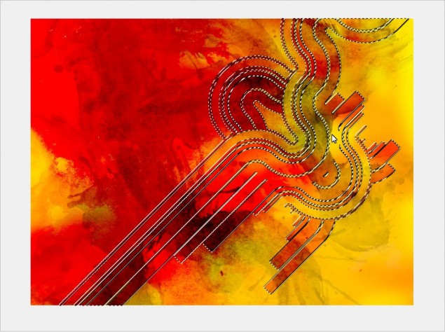
Step 19:OK, with that all in place, we now need to mask off the parts of the shadow that shouldn’t be visible, and we’re going to use the main overlay object as our stencil.  So click on the overlay object and then hit Ctrl-M to generate a mask from it like this:

WARNING: Make sure you have the OVERLAY object selected for this step, not the shadow layer object!

Step 20: Once the mask is created, you need to click on the shadow object in the docker:

Step 21: And now simply hit delete and VOILA!  The extra area of the black shadow is gone and you now have a nice little shadow under your Overlat object:

WARNING: Make sure when you hit delete that you currently have a mask tool such as the rectangle mask tool as your current tool type, not the object picker.  If you do not have a mask type tool currently selected, the entire shadow layer will delete, rather than just the area you have masked off!

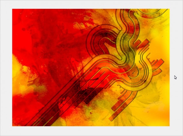
Step 22: Hit the remove mask button or Ctrl-R and here’s how it looks:

Step 23: It looks cool, but I find the shadow is too prominent, so I’ll lower the opacity to give it a more subtle effect:

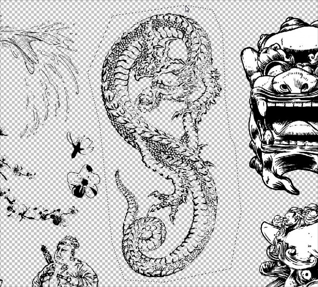
Step 24: OK, now with that all done, let’s add more symbols to the background… I’ll go ahead and open the EPS for the East Asian Folkart set and import it at 12000 pixels wide again… I’ll zoom in and pick a symbol, in this case a sweet looking dragon.  Repeat the same steps as last time, mask it off and copy/paste it in to our project.

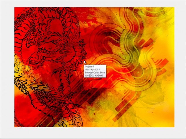
Step 25: Once again, play with your layer styles for the dragon and find something you like… I like the Overlay again, so we’ll go with that:

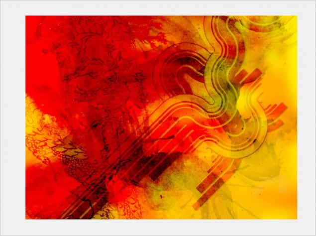
And here’s how it looks now:

Aaaaand we’re done!
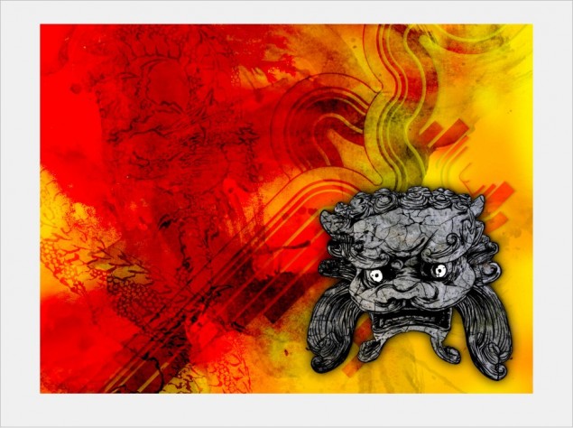
At this point, I really love the background and I think it’s time to start adding our foreground elements, or just leave it as is!  I went back in to my East Asian Folkart set and grabbed a cool looking idol object and worked that in to my drawing.  I basically colored it a bit and added some stone and crack textures.  You can see how that’s done by reading my cracked rock texture tutorial located HERE.

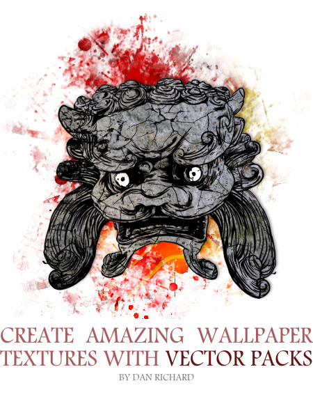
Here’s what I came up with after a few minutes:

So that concludes this tutorial on using GoMedia Vector and Texture packs to create awesome designs in minutes with Corel Photopaint.  If you want to pick up some of these packs to try them out, they are VERY reasonably priced so anyone can afford them and you can scope them all out on the GoMedia Arsenal page by clicking HERE!

Please use the functions below to share and comment this tutorial!
Dan

Script for Converting Object PNGs to Black Masked Background PNGs and Blank Nib Pack for Corel Photopaint X4

Script for Converting Object PNGs to Black Masked Background PNGs and Blank Nib Pack for Corel Photopaint X4

Good evening everyone! I am now on a new PC that I just built so I can finally work on those huge 300 DPI poster images without taking 10 minutes each time I try to do something in Corel Photopaint. Along with my upgraded PC I also went ahead and updated to the latest version of CorelDraw Suite X4. I’ve updated from version 12, so I’ve missed quite a few versions over the last couple of years so I’m getting used to the new changes and features and I am trying to work out some kinks.

First off, I am VERY happy to see that X4 has FIXED the NIB problem! I can now delete and add nibs and the thumbnails aren’t all screwed up! If you’re not sure what I am talking about, you can check out some posts I’ve made on the matter here:

It’s Official – Nib Bug is Unresolved Bug in Photopaint

Corel Photopaint Nib Error Explained… and it’s still a bug in X3!

So now that they’ve got the NIB problem fixed, I should be as happy as a pig in mud right? Nope, Corel has decided to throw a new problem in to the mix. You might remember a tutorial I wrote awhile back on How to import Photoshop ABR brushes in to Corel Photopaint. In one of the steps, we talk about opening up a PNG image, and in Corel Photopaint 12, 32 bit PNGs open up as a mask on a black background. So, all you had to do was click on “Create Nib from Mask” from the Nib toolbar and you were all set. Well now, when you open a PNG in Corel Photopaint X4, the PNG loads as an unmasked object on a blank transparent background.

Now, you can create a mask of the object and add that as a Nib, but it doesn’t work properly, the Nib seems to be inverted. So, the manual process here is to create a mask from the object, change the background color to black, then merge the object with the background and then add the Nib.

Let me first say, at this point I have no idea if there is a setting in X4 so that PNGs open as a masked black background. I’ve looked on Google and found a couple of people reporting the same issue, but no solution has been found. If I find one, I’ll be sure to post it, or if you know how to set this, please click the comment button below and share the knowledge!

In the meantime, I created a quick little Corel Script (.csc) to automate the process of creating the mask and merging it to a background. I have also included a new blank .Nib pack so you can easily have an empty template to create Nib packs.

Click here to download the Script and blank Nib pack.

This script and Nib file is confirmed to work in X4, but I suspect it will work in any of the X versions as well as 11 and 12.

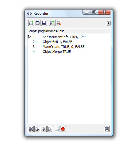
Here’s what the script looks like:

Simple eh? If you’ve never used scripts before, they are extremely handy and a HUGE time saver. Here’s how you load this script:

1. Unzip the file and save the .csc file somewhere handy
2. Open Corel Photopaint
3. Set the background color to black
4. Click on Windows » Dockers » Recorder
5. The Script Recorder will now open… click on the folder icon and browse to where you saved the script file you downloaded.
6. Open the PNG file
7. Press the Play button on the Recorder Docker and you’re done!

PLEASE NOTE that you must have black selected as the background color before running the script!


And this is what you will end up getting… the object on transparent background becomes a black background with a mask of the image:

Once again though, Corel has failed to allow us to create a blank Nib file from the menu, so I went ahead and deleted every Nib from the default one and saved it as a blank template for you. So if you want to create a Nib pack of just leaves for example, you can load the blank template, save it as LEAVES.NIB and start adding your Nibs!

WARNING!!! Remember to first save the blank template as something else BEFORE you start to add Nibs. Remember, when you make changes to a Nib, it’s automatically saved right on the spot, so don’t make the mistake of adding Nibs to your blank template or deleting stuff you shouldn’t. For example, let’s say you load the blank template you downloaded and add a bunch of Nibs to it, then you do a ‘save as’ and call it mynibs.nib. Well, not only do you now have Nibs in that mynibs.nib file, but if you go back to the blank Nib template, you’ll notice it now has all those Nibs too! Oops! So remember that changes to the Nibs are saved real-time, make sure you are changing the right file!!!

If you’re reading this and wondering how you’re supposed to load the blank Nib template or how to add the Nibs, please be sure to read the tutorials I wrote on how to do this:

Importing Brushes – How to import Photoshop ABR brushes in to Corel Photopaint! Learn how you can import Adobe Photoshop .ABR brush packs into Corel Photopaint and CorelDraw and use them as nibs on your brushes!

How to Load and Install Corel Photopaint NIB Brush Packs! Learn how to install NIB packs in to Corel Photopaint and learn about why working with the Nibs management is so difficult!

So let’s have a round of applause for Corel for finally fixing the Nib thumbnail problem… Bravo! Now, please fix these other 2 issues:

1. Would be nice to be able to create a new blank Nib template by clicking New in the Nib menu.

2. The 999 pixel limitation for Nibs sucks! I’ve got Photoshop brushes twice that size, but I have to reduce them to 999 pixels so I can work with them in Photopaint. Boooooo!

With that said, I am going to start working on some new packs for you guys to download, it seems the first few I made have been extremely popular. The old ones though are screwed up, they contain all kinds of different brushes, not just what the pack is supposed to be. I’ll work on cleaning those up as well as provide you guys with new pack conversions.

That’s it for now, enjoy!
Dan

UPDATE September 18, 2008

I was browsing the CorelDraw forums and I found this:

Hi,
this (mis-)behavior was intruduced in Photopaint X3 SP2. Corel states this as a new Feature:

GIF/PNG

  • Transparencies are preserved and displayed correctly when opened with Corel PHOTO-PAINT. Previously, transparencies were viewed as masks.
  • Image color and alpha channel transparencies are maintained on import into CorelDRAW.

  • Unfortunately the Second point is wrong! There seams to be no way to get back the color-information in 100% Transparent areas.

    Photoshop suffers this same misbehavior since a long time (i think ever), but there is a 3rd party import/export-plugin “superPNG” correcting this and opening PNGs with a mask. Sadly this plugin doesn’t work with Photopaint (“File Format Plugins”,.8be), eaven if photoshop-filter-plugins (.8bf) do work in Photopaint.

    @Corel: It would be greatly appreciated, if there would be a way to open PNGs without loosing imageinformation. Just as in all former Corel Versions.


    So looks like this was done by Corel on purpose and there is no way to set it back to how it worked before.