Browsed by
Tag: Corel Photopaint

How to Load and Install Corel Photopaint NIB Brush Packs

How to Load and Install Corel Photopaint NIB Brush Packs

A little while ago, I started offering a few brush packs for Corel Photopaint users on my blog (You can actually find those HERE) and I’ve been receiving quite a few inquiries on how exactly one goes about installing them.  Today’s little tutorial will run you through the easy process of installing the packs and explaining how they work.

WARNING: PLEASE NOTE!  Do not think of these as extra brushes you can pick… these are complete nib replacements for Photopaint, so when you use one of these packs, it will contain the default Photopaint brushes AND the extra brushes stated in the pack you download

The first thing I need to tell you is that the NIB management in Photopaint absolutely SUCKS and it’s full of bugs that have yet to be resolved.  in fact, if you Google around, you’ll find tons of posts from angry Photopaint users asking about various issues with loading, creating and deleting Nibs for pretty much any version of Corel Photopaint, including right up to X3, the latest release.  In fact, if you mess around with the Nib packs too much, you can completely corrupt the install and then you’re in for some real fun.  Here are some wonky things I noticed in the Nib management area:

  • There is a maximum number of Nibs you can add, and it’s very limited.  To make matters worse, if you hit that maximum, your Nib list starts going crazy. I don’t know what the max is… I hit it once and it killed my install and it was only after I found out there was a maximum.
  • Shouldn’t delete nibs, only add to the current ones in the pack you are using.  It’s hard to describe what happens to someone who hasn’t experiences the marvel of this absolutely infuriating bug.  Basically, let’s pretend you have 50 nibs in your pack and you delete the last two.  Let’s pretend the last 2 are some kind of circular brush.  Now, let’s say you add 2 new nibs to this pack… instead of showing the new nib in the list, it will show you the two circular nibs instead!  BUT, when you click on the nib, it will actually be your new nib shape.  Now, imagine the frustration of having a pack with 50 nibs that all have the wrong thumbnails attached.
  • You can’t start a new nib pack… you would think you can create a blank pack and start adding your own brushes, but you can’t.  I even found a blank nib pack on the net awhile ago, but when I tried adding nibs to it, I got the same issue as mentioned in the previous point.

I love Corel Photopaint, but the NIB interface is absolute crap and it’s the only huge bug I know of in Photopaint and it baffles my mind that this has not been fixed after several YEARS!  So, with that said, screwing around with Nibs SUCKS, so don’t do it unless you’re pretty good and navigating the unknown in the realm of software.  Lucky for you, I have these easy to download and install replacement packs!  You don’t have to worry about messing around with your packs, deleting and adding nibs etc… you simply download the pack and load it and you’re done.

Again, don’t think of this as extra brushes you are adding to Photopaint… it’s not.  These are complete Nib replacement packs that contain all the default Photopaint Nibs PLUS the extra Nibs stated in the pack.  So if you download the Blood Pack, each Nib pack includes the default Nibs, PLUS the Blood Nibs.  Make sense?

OK, so now let me show you how to install the packs, it’s easy.

Step 1 – First thing you need to do is open Photopaint and either open up an image to edit or create a new file.  We’ll need to have something open to access the brush tools.  Once that’s open, we’ll need to open the Brush Settings Docker.  Click on Window > Dockers > Brush Settings and the Docker will open.

The Docker will open and probably be blank like this:

To activate the Docker so it shows the options, click on the Paint Tool icon, or just hit P:

be sure to stretch the Docker open so you can see all the options:

Step 2 – Time to load the Nib pack!  Click on the Nib Options button (circled in red below) and then click on Nib Load to open a file browser window:

Now, just browse to the Nib pack you downloaded and extracted and click on the one you want:

All done!

Step 3 – You can now select the nib shape and get to work!  Just use the Nib Browser to scroll through the thumbnails and you’ll see that you now have the same default Nibs, plus the custom ones towards the bottom:

Click the one you want and you’re good to go!

Pro Tip: Remember, you can use these brushes with any of the Paint tools, eraser, clone tools etc… any tool that lets you use a Nib will let you use these custom packs.

That’s it gang, easy as pie… Thanks again for reading my tutorial and please be sure to comment below or share this with your friends!

Thanks,
Dan

Creating Cracked Rock Text, Faces, Orbs and other objects in Corel Photopaint!

Creating Cracked Rock Text, Faces, Orbs and other objects in Corel Photopaint!

Welcome to another Corel Photopaint tutorial by yours truly, and today we’re going to show you a VERY cool effect that is a breeze to pull off.  I’m going to show you how to apply a cracks to text, photos and other objects by using a simply texture and some layer blending.  This is easy as pie, but can be used to create some fairly complicated photo manipulations.  This is especially popular for people that like making those dark zombie style photo manipulation projects, but this is also great for creating rock text and other fun effects.

What you need to know

This is probably my 20th Photopaint tutorial, so I think the need to describe and illustrate each and every click is becoming a bit redundant don’t you think?  From now on I’ll gloss over items we’ve already discussed in great detail and dedicate the time on areas we haven’t explored together.  What I will do though, is mention what other tutorials you should know before-hand as the lessons taught on those tutorials are applicable to the current lesson.

In this tutorial, we’ll be adding some gradient style text effects with the Interactive Transparency Tool and creating a simple reflection effect, so if you’re not familiar with how to do this, please read my tutorial on creating the Sheen Text Effect. This tutorial covers these tricks in greater detail.

With that said, let’s get started!

Step 1: Our first step will be to open up Photopaint and create a new canvas with a black background.  I find the cracks stand out better on a black background, but nothing is stopping you from applying this to a white one either.  So let’s go with a black background and write out some dark grey text:

Step 2: Now go find yourself a nice photo of cracks!  NO not THAT kind of crack.. *shakes head*  This Kind!  Once you find a texture you want to work with, go ahead and paste it right over top of the text we created in Photopaint:

Here is the texture I used:

And here it is copied in to my project:

Step 3: And now we start the magic!  Change the object layer that contains the texture to Overlay and this will apply an overlay blending mode of this object layer to the object layer below it:

Ta-Da!

Now theoretically, you could save your text now and call it a day, but that’s more than a little boring, I think we need to jazz up this effect a bit more and make it grittier and just more interesting overall.  The first thing we need to do before we play is crop out the part of the texture image that we don’t need.

Step 4: Make sure you click on the text object layer on the object docker and hit Ctrl-M to generate a mask around the text:

Now click on the texture object layer and select the mask tool:

Now hit Ctrl-X (You’ll suddenly see your original grey text) and then Ctrl-V (and your cracks are back!).  You just did a cut and paste function…  At first it will appear that nothing has really changed:

But if you look at your Object Docker, you’ll see that crack text part is now in a new layer and is separate from the main texture image you started off with:

Now just click on the main texture object layer and delete it, you don’t need it anymore:

WARNING: At this point, our overlay layer is gone and you can choose to re-apply it to the object layer that has the cracked tex, or you can leave it normal.  You might be asking what the difference is… if you set the layer to Overlay, any textures or details on the layer below it will be blended with the top layer.  This is what you HAVE to do when applying the cracks to a photo.  But in this example, the grey text layer is completely solid so we don’t need to re-apply the overlay.

Step 5: Now combine the two text object layers and you are now ready to add some highlights to the text!

Step 6: Ok first off, we’ll add some dark gradient to our text.. so go ahead and do a copy/paste of the text and darken it up, and make a gradient from it.  If you don’t know how to do this, I recommment you read this tutorial, which covers the procedure of creating gradient text in detail.

Dark layer:

Step 7: Now you can go with that or add some dark shadows to the bottom of the text… this is a bit different to how I normally do this, so lets go a bit in detail on how it’s done.  First, create a duplicate of the text and decrease it’s brightness 100% so that the text is solid black:

Now go ahead and apply a Gaussian Blur effect to the text… a pixel radius of about 4 should do it:

Use the Interactive Transparency Tool to add the gradient fade to the blurred shadow:

And finally, open up the objet’s properties window and adjust the opacity to tone it down a bit:

And there you have it!

Step 7: In this next step, I’ll show you how to brush on some effects to your text and have it only apply to the text instead of the entire canvas.  In this case, we’ll add a splatter of blood to the text.  You start off by combining all the text layers together in to a single object layer, then hit Ctrl-M to add a mask around the next like this:

Now grab a blood splatter brush, choose your color and opacity and add a bit of good ol’ violence to your text!

PRO TIP: You can download a blood splatter nib set from my blog site at www.danrichard.com!

Add a bit more to the other corner:

Step 8: Now just add a little reflection (You can read my tutorial on reflections here) and you are done!

Now those of you may be wondering why I said it could be applied to text, objects, photos etc… when so far all I did was text.  Well, because if you experiment with various layer styles, you can use this exact same technique to add cracks and other textures to anything you want!  Here are some additional images I applied the exact same trick to, along with what they looked like before:


That’s it for this one, thanks for reading and I hope you enjoyed!  Remember to post a comment or use the buttons below to share.

Thanks,
Dan

Smoothing Skin, Enhancing Eye Color, Sketch Effect, Contrast and Color Isolation in Corel Photopaint!

Smoothing Skin, Enhancing Eye Color, Sketch Effect, Contrast and Color Isolation in Corel Photopaint!

Welcome to another Corel Photopaint tutorial!  In today’s lesson, we’re going to be using Corel Photopaint v12 to look at some of the basic tricks for editing your photos that are fairly common and should be part of your basic graphic knowledge.  In this tutorial, I’m going to show you how to smooth skin like a magazine cover, how to enhance eye color with the airbrush, create a greyed out desaturated look with isolated colors, enhance photos with contrast, and finally, how to convert a photo to a pencil sketch.  I’m going to cut down on repeating keyboard shortcuts and basic functions, such as how to copy/paste, so if you don’t know how to perform there simple functions, please read some of my older tutorials that details these areas.

Now the master plan here is to perform all these effects, one right after the other to create a final piece, but feel free to stop anywhere in this tutorial if you’ve already reached the desired effect.  For example, the first part of this tutorial covers how to smooth out skin, so if that’s what you needed to learn, then you don’t really need to go any further.  After that we’ll cover the eye enhancement and then just keep going through various tricks that can be combined into one final photo manipulation.

We’re going to start off with a photo I downloaded from a free stock website some time ago, which is of a beautiful girl with amazing eyes and textured skin that will work very well for this tutorial.  The harsh sunlight really raised the bumps and pores of her skin more than an average photo, so this will work quite well for our lesson:

And once we’re done playing with all our tricks, we’re going to end up with a final photo that looks like this:

Now this is going to be quite a large tutorial with over 75 images in total, so we’re going to split this up into several sections and pages.  I’m going to break this down as follows:

  • Part 1 – Skin Smoothing
  • Part 2 – Eye Enhancement and Airbrushing
  • Part 3 – Desaturation and Color Isolation
  • Part 4 – Contrast Enhancement and Softening
  • Part 5 – Sketch Effect

So let’s get started!

Part 1 – Skin Smoothing

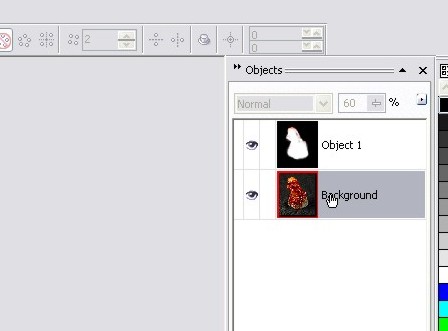
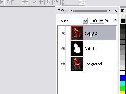
Step 1 – Let’s start off by opening up our source image in Corel Photopaint and making 2 duplicate objects of the photo.  So in all, you should have the background layer, which is the photo, and two additional copies of the photo as extra objects:

We’re going to actually only touch the 2 object layers, but I like to make 1 extra copy just in case I need the original photo for something.  So in this case we’ll be working on the two object copies, and we’ll leave the background copy alone for the time being.  Before you continue, be sure you select the top object layer as that’s our first level of attack in this tutorial.

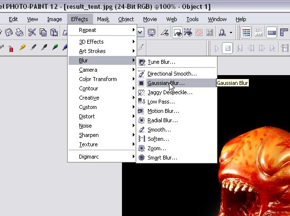
Step 2 – The first step in creating our smooth skin is to create a primary layer of smooth skin, and we do this by applying a fairly significant Gaussian blur to the photo.  Go ahead and click on Effects > Blur > Gaussian Blur:

Slowly increase the pixel radius control button until you get a level that obliterates all the rough bumps and skin textures.  Don’t worry about stuff like the eyes and hair getting too blurry, it won’t matter as you’ll find out in later steps.  For this particular photo, the level of smoothness I wanted kicked in at a pixel radius of 7.  Click OK and your blue is applied.

Step 3 – We now have a basic smooth skin layer, but we’ve lost a lot of detail in areas we didn’t want to smooth out.  So let’s fix this up by selecting the eraser tool:

Grab a nib that is fairly large, but don’t go too huge or else you’ll lose control on the parts you’re erasing and you’ll go too wide.  I’ll go with a 57 pixel nib with a very soft circular gradient effect:

Now start with the eyes… slowly click and move the mouse around the eye, being sure to erase the entire eyeball, eye lashes and other details around the eye socket:

Don’t forget the eyebrows and hair line:

Now we work the other side:

Along the cheek:

The lips:

Nostrils and tip of the nose:

Work in the details of the nose ridges:

And finish off by erasing along all remaining hairlines:

With that done, we’re now brought back the detailed areas we want to keep, BUT we’ve revealed some areas of skin that need smoothing again.  Click on Page 2 and we’ll fix up these detailed areas and finalize the skin smoothing portion of this tutorial.

Step 4 – For this step, we’re going to detail the skin smoothing with the Touch-Up Brush, which is a no-brainer tool to quickly fix up blemishes, uneven surfaces and much more.  It’s extremely handy for photo editing and you’ll definitely want to have this tool as part of your know-how arsenal!  So let’s start by selecting the Touch-Up Brush and selecting the brush’s application settings.

I’m going to select a size 50 nib for decent coverage… this is a good sized photo so a tiny brush nib isn’t required.

And finally, select the desired brush strength… the higher you set the strength, the more intense the smoothing action will be.  We don’t want to go too nuts, so I’ll keep the strength low:

WARNING: Before you start to brush, make sure you pick the middle layer!

Be sure you select the layer UNDER the main smooth skin object or else you’ll just be trying to smooth that blurred out object layer.  So click on the second object in your object docker before continuing:

Step 5 – OK, let’s zoom right in and start with the nose area.  Start by slowly brushing any bumpy textures you see along the nose… be sure not to run the brush over the areas that separate light and dark, or it will blur the lines you want to keep crisp.

Here we see the results of brushing the nose with the Touch-Up Brush:

Now do along the eyes and lips… If necessary, you can reduce the size of your nib to get into tighter spots:

And you’re done!  Here’s what I ended up with:

Now, before we continue on to the next part, let’s see a before and after image of our skin smoothing:

As you can see, we’ve completely transformed this photo into a beautiful smooth complexion that’s ready for any magazine cover!  This now ends the skin smoothing portion of the tutorial.  Please continue to Part 2 – Eye Enhancement and Airbrushing.

Part 2 – Eye Enhancement and Airbrushing

As someone who uses a real airbrush for model painting, I can honestly say that you should approach digital airbrushing in the same manner.  You want to keep your paint thin and slowly build up color, rather than paint thick and opaque.  Unfortunately, many beginners make the mistake of rushing the airbrushing technique and piling on color too quickly and basically get frustrated and not use this handy tool.  If you take your time, you can learn how to master the airbrush very quickly and use it for professional touch-ups and beautiful artwork pieces.  In this part of the tutorial we won’t go too far into airbrushing, but we’ll look at how to use it to enhance eye color for gorgeous portraits and hopefully that will nudge you into expanding your airbrush use for all out drawing and photo enhancing.

Step 1 – Go ahead and select the Paint Tool and then set up your airbrush settings:

In the Paint Tool properties bar, select the Airbrush brush style nib and set it to 10 – 15 pixels wide:

And here is the key…  set the transparency to a very high 95% – 99%.  This means that your brush strokes will be BARELY visible and it will take multiple strokes before the color you are airbrushing is actually visible.  For this tutorial, I’m going to work with a 98% transparency.  Remember, the trick is to build up the color very slowly and highlight the color that’s already there… we’re not changing the eye color, we’re enhancing it and making the color pop out.

Now select a light color to match the eye…  For this photo I could go with a green or blue, so I chose a mid-level cyan hue:

You’re now ready to airbrush the enhancement color!

Step 2 – Now, start to apply the airbrush in complete sweeps around all the blue areas of the iris.  As you continue to sweep the cursor back and forth, you’ll start to see the color build up and slowly brighten up the eye.  Don’t goo too nuts, keep it realistic!  Once I had the blue/green popping out the way I wanted, I switched to a yellow color and worked the yellowish interior of the iris to enhance that color as well:

Then take some white and light airbrush the white of the eyes to brighten it up just a touch.  Don’t go too crazy and completely whiten the eye or it will look unnatural.

Step 3 – Next we’ll want to clear up some of the red veins within the white area of the eyes, so grab the touch up brush again and clean up the white:

Don’t forget the other side!

Step 4 – That’s about it!  Now step back and set your zoom to 100% and check out your handy-work… everything look good?  Zoom back in and touch up any remaining spots you may have missed and your eye enhancement is complete!

Now before we move on to the next step, I want to point out a small tip that some folks may feel is a worthy step… Some people may feel that the skin is a touch too unnaturally smooth, so before we merge all our layer objects together, we can add just a slight touch of skin texture for a subtle realistic touch.  It’s a simple trick, and you can play around with it and completely vary the amount of texture you add to the skin.

Simply right click on the top object layer and go the object properties:

Now move the Opacity slider down and you’ll see the textures pop out as you reduce the opacity.  I’d recommend staying at 80%, but you can play around and see what looks best for you.  Click OK when you have an opacity level you want to stick with or just click cancel to stick with 100%.

Step 5 – Now combine the 2 object layers together and VOILA! You’ve got airbrushed enhanced eyes with gorgeous realistic colors:


Ready to keep going?  Please continue to Part 3 – Desaturation and Color Isolation!

Part 3 – Desaturation and Color Isolation

In this section, we’re going to learn how to create a desaturated toned effect with color isolation.  I’m sure you’ve seen this effect before where the photo or image is black and white except for a 1 or two elements that are full color.  It’s a very popular effect that looks quite dramatic when pulled off right.  Let’s get started!

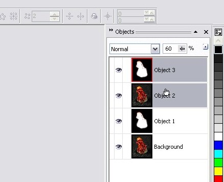
Step 1 – Start off my making a duplicate of the main object layer we’ve been working with.  We’ll be applying our desaturation filter to this new copy.

Step 2 – Let’s desaturate the new copy… click on Image > Adjust > Desaturate and to apply the effect:

You now have a greyscale copy of our photo piece.

Step 3 – This isn’t really a necessary step, but I like adding just a hint of toned color to the overall desaturated layer.  You can do this by opening up the object properties and lower the opacity to the 80% range.  Play around with various opacity ranges and see what you like, or just leave it at 100% greyscale.

Step 4 – OK, time to let our colors shine through!  Click on the eraser tool and adjust the size to around 20 pixels with a circular fading nib.  You don’t HAVE to go with those settings, but it’s my preferred style for erasing.

Adjusting the eraser nib size:

Now zoom right in and start erasing the areas where you want your color to come through!  I’m going to work on the eyes, eye shadow, and lips…
Iris of the eyes:

Here we see how it looks with one iris done:

Now I have both eyes done and the eye shadow areas:

Now zoom in and do the mouth:

I like to do around the edges of the mouth with a semi-transparent brush… it helps blend the colored lips into the desaturated skin tones.  So here I adjust the transparency to half:

Then I brush the outer edges of the lips:

And we’re done!  You’ve now desaturated the photo and isolated specific colored areas to give the photo an entirely new dramatic look!

You can now move on to the next page to see how I use a simple trick for an additional professional touch in Part 4 – Contrast Enhancement and Softening.

Part 4 – Contrast Enhancement and Softening

In this section, I’m going to show you a simple trick that I use on photos quite a bit… it’s super easy and it’s a great way to add a professional touch to your photos.  This works on portraits, stills and all kinds of other photographic applications.  In our case, it’s just going to make the enhanced elements of our piece stand out even more and add a soft glow to the photo.  This type of trick is also know as the “Dreamy Photo” effect or “Angelic Photo” effect.

Step 1 – Before we get cooking on this portion of the tutorial, let’s combine our two main object layers together again:

And once again, create a duplicate of our merged object layer and make sure you’ve got the top object layer selected:

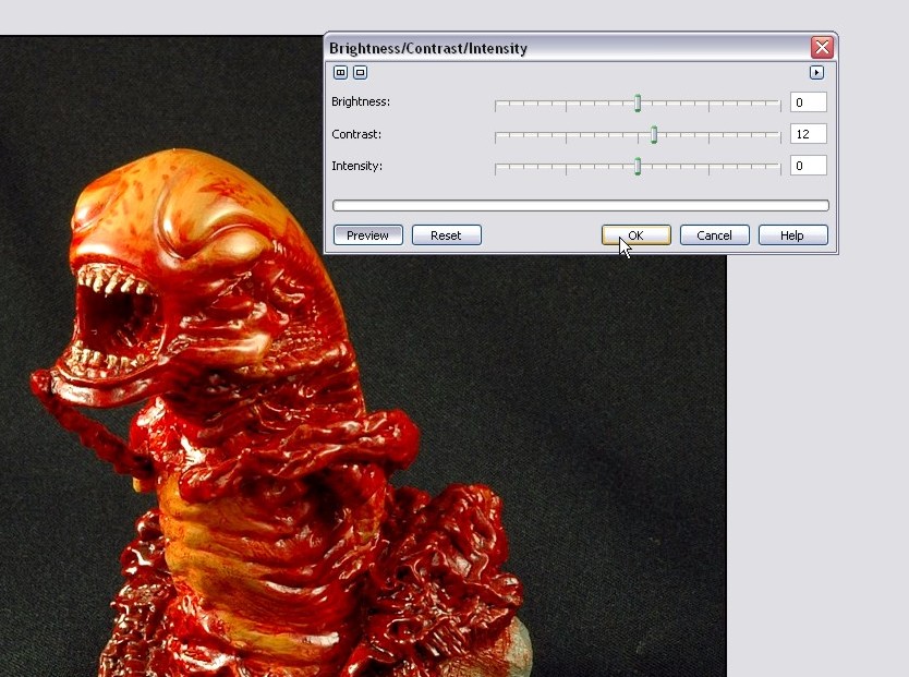
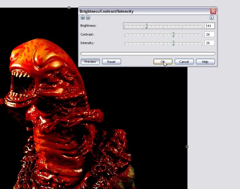
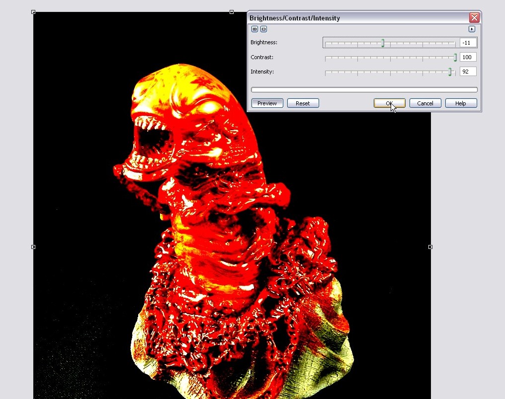
Step 2 – Pop open the Brightness/Contrast/Intensity adjustment tool (located under Image > Adjust >) and crack up the contrast all the way up and increase intensity about halfway.  You can mess around with the contrast and intensity to see how the tool works and how it affects the image you’re working with.  Once you’ve got a combo you like, hit OK.

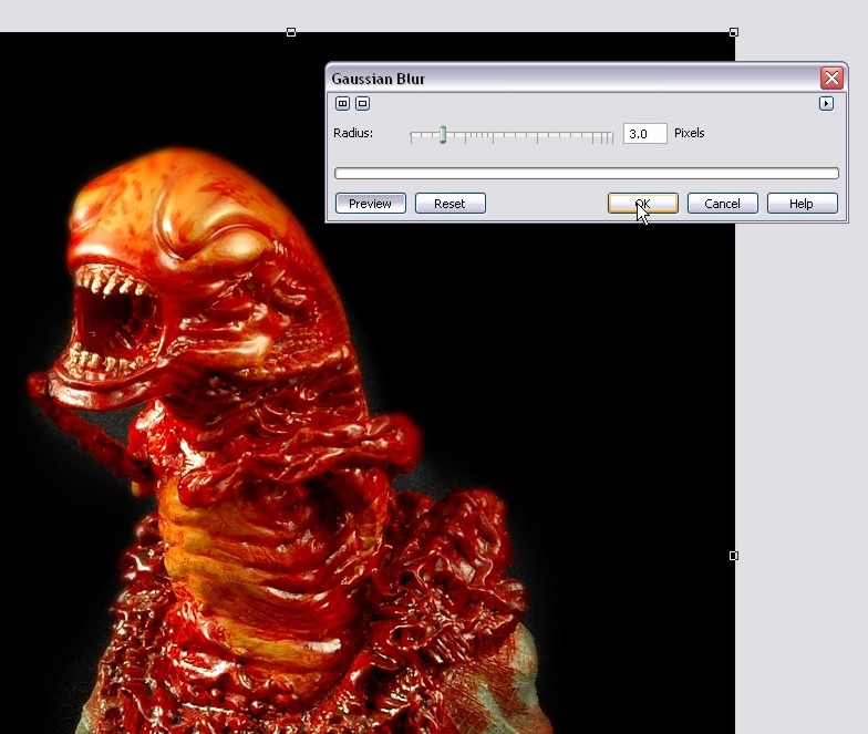
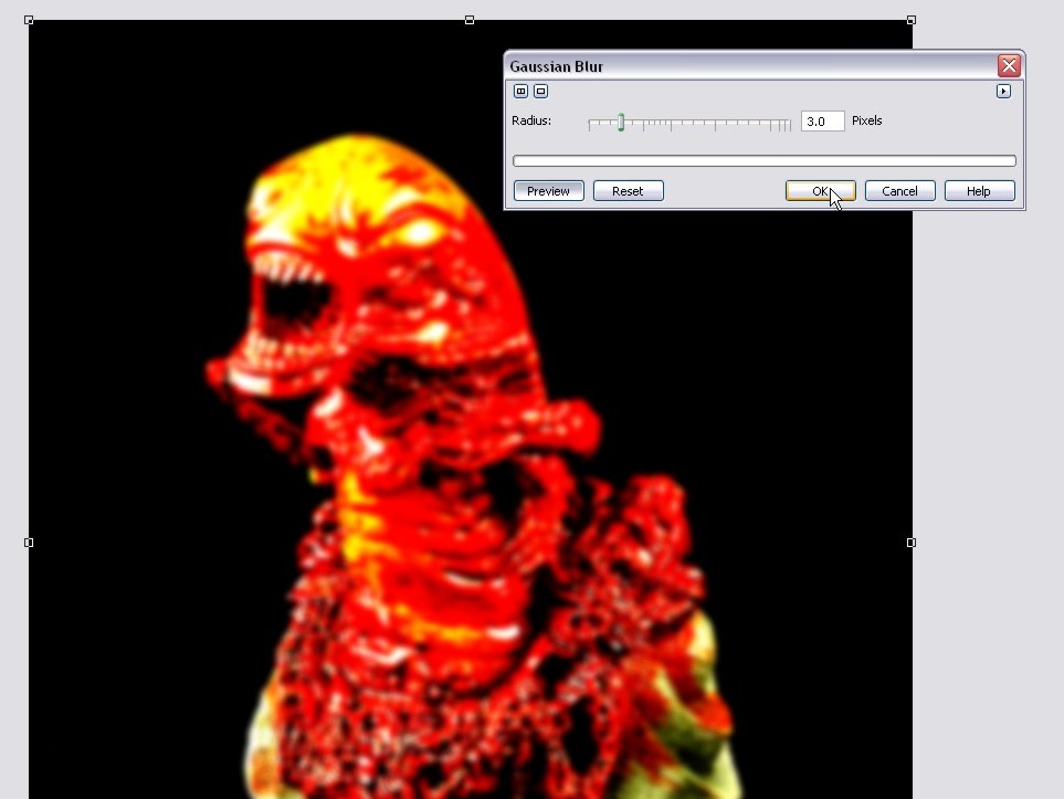
Step 3 – We now need to apply a small Gaussian Blur to the object… around a 3 pixel radius should do it, but feel free to play around.  The larger the pixel radius, the more glow you give the photo… just bear in mind that if you go too high, the object will thin out too much and you’ll lose the effect.  I wouldn’t recommend going past a 6 or so.

Going with a pixel radius of 3:

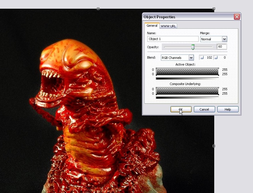
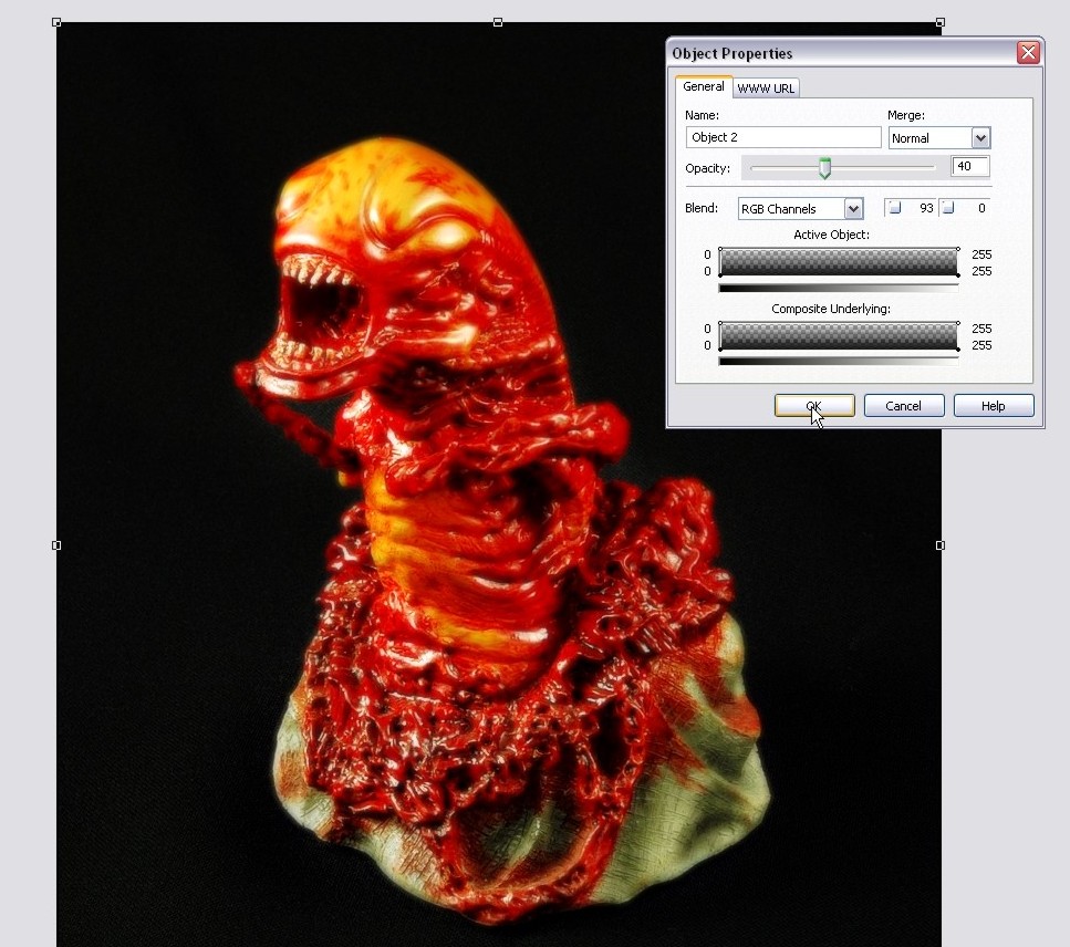
Step 4 – Now open up the object properties of our blurred layer and turn down the opacity to around 40%.  We want to have a soft glow to the photo, not blur it right out!

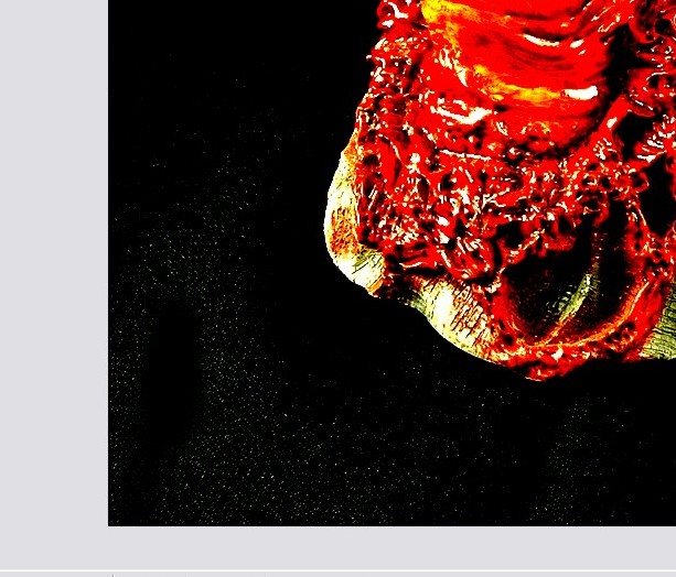
Step 5 – OK, now you need to grab the eraser tool and erase any are where you want the details to pop out and not be fuzzy:

We’ll work the eyes and eye brows:

Hair:

Her lips and the lip stud and you’re done!

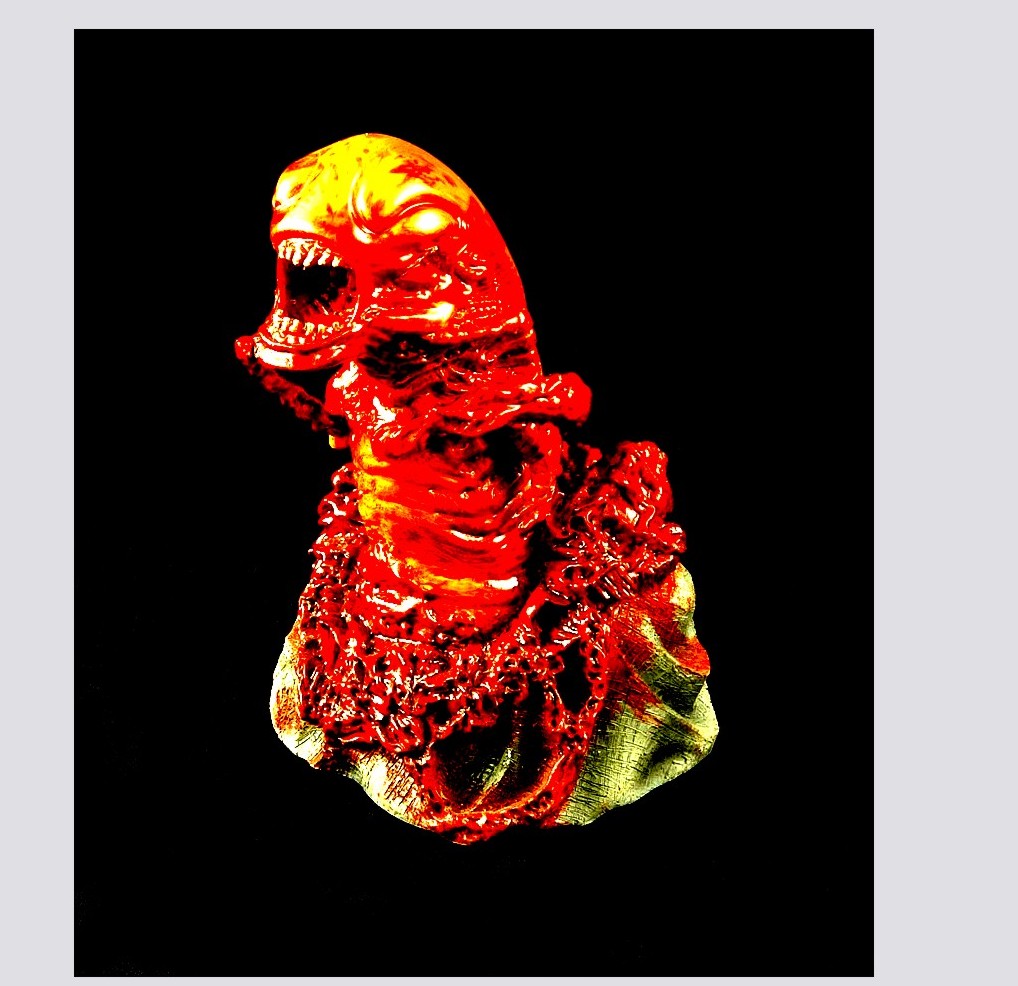
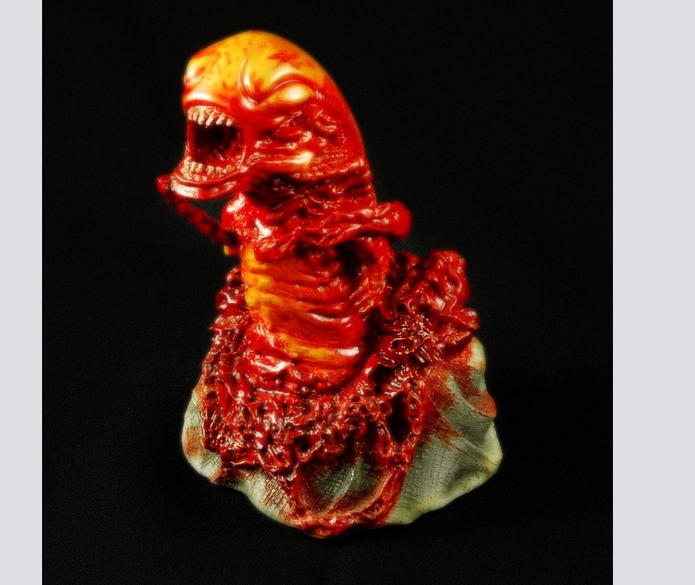
Zoom back out and you can see your photo now has a dreamy soft glow to it with deeper overall contrasting shadows.  You can actually click the visibility icon (the little eye) on the object docker of the top layer to see how it looks with and without the effect.  If you’re happy, it’s time to move on to the final part of this tutorial!

Part 5 – Sketch Effect

To end off this Photo Editing 101 tutorial, I’m going to show you how to turn a photo into a sketch in just a couple of clicks and then we’ll blend that into our photo project for a nifty little effect.

Step 1 – Now, instead of combining both object layers together, we’re actually going to blend both into the background this time:

And then create a single duplicate of the background layer:

Step 2 – Alrighty then, time to turn this photo into a sketch!  Click on Effects > Art Strokes > Sketch Pad:

And easy as pie, your photo is now a sketch… play around with the various sliders and see how they affect the look of your sketch.  Once you hit a configuration you like, click OK to apply the effect to the object layer.

Your photo is now a pencil sketch!  But, we didn’t do all that work just to end up with a simple pencil sketch did we??  Let’s blend this sketch into our colored photo and create a cool grungy effect.

Step 3 – Grab the Interactive Object Transparency Tool (you didn’t think I could write a tutorial without using my favorite tool did you?!) and we’ll apply a transparency gradient across the entire layer.

Apply your transparency:

Step 4 – You can then grab your eraser tool and clean up the photo piece a bit… in this example, I cleaned up the white of the eyes and the thicker portion of the lips:

Guess what?  We are done like bacon!  From here you can continue to apply effects, brush in some grunge effects, add text or whatever else comes to mind!

Well that concludes another tutorial from little ol’ moi, so I hope you’ve enjoyed this introduction to fairly basic and useful photo editing tricks and I hop you look forward to my next tutorial!  Until then, keep practising and thank you for reading. Please don’t forget to comment below!

Dan

Importing Brushes – How to import Photoshop ABR brushes in to Corel Photopaint!

Importing Brushes – How to import Photoshop ABR brushes in to Corel Photopaint!

Introduction

Welcome to another Photopaint tutorial, and this time I think you Corel folks are going to LOVE what we’re going to do here.  I’m sure if you surf graphic sites and such, you always see people using these awesome brush packs for Photoshop, but if you use Photopaint, you’re SOL.  So you go on Google and search your heart out for ways to import these .abr brushes into Photopaint, but all you find are forum threads about people asking this very same question with either no response, or someone said “Sorry, you can’t, change to Photoshop”.  Well my friend, guess what?  NONSENSE I SAY!  Of course you can do it, so today I am going to show you how to convert and import .abr Photoshop brushes right onto Photopaint and use them as Photoshop nibs (what Photoshop folks call brushes are referred to as nibs in Photopaint).

Oh, and fun doesn’t stop there folks!  Not only will you FINALLY be able to use .abr brush packs in Photopaint, but you DON’T need Photoshop to do this and it won’t cost a cent for the third party application we’ll need to perform this wondrous task.

Have a I mentioned how excited I am bringing this to you guys?

Actually, I was a sweet tutorial a few days ago that was a photo manipulation project, and it uses this beautiful set of fairy wing brushes from DeviantArt.  I downloaded the .abr file and of course they were all but useless.  I knew there was a way to use the brushes, but I just couldn’t remember, and there was literally ZERO support online on how to figure it out.  So I altered my search and started looking for converters that could convert .abr brushes to .png files.  That’s how I found an application called ABRviewer, and it did exactly what I needed.

So here it is gang!  Read on and learn how to get those .abr brush sets working their magic in Photopaint.

Setting Up

Step 1: The first step is to download the latest version of ABRviewer.  This is a completely free, open source application you can download from Source Forge.  If for some reason SF is down or they stop serving this application, I have attached the 2.0 version to the tutorial, which you can download HERE!

So go directly to http://sourceforge.net/project/showfiles.php?group_id=143912 and click on the green Download link for the version you want (I recommend you grab the latest):

On the following screen, click on the filename you want to download (On this screen shot, the first file is the documentation and the second file is the source code.  We want the third, which is the distribution set used to install the application):

Step 2: Once the download is complete, unzip the archive to a temporary directory and run through the setup to install the application.  Once installed, you’ll find the new application under Programs > abrViewer.NET 2.0 and click on abrViewer.NET 2.0 to launch the application:

Conversion Process

Step 2: Once the download is complete, unzip the archive to a temporary directory and run through the setup to install the application.  Once installed, you’ll find the new application under Programs > abrViewer.NET 2.0 and click on abrViewer.NET 2.0 to launch the application:

Conversion Process

Step 3: Time to load the brushes we want and export them to .png files!  With the application now open, click on the Load Brushes button and browse to the folder where the .abr file is located:

Simply double-click on the .abr file you want and it will show you a preview of the brushes contained in the pack:

Now click on Export > Thumbnails and it will open a file browsing window.  Browse to the folder you want to save the .png files in and click OK.


This is what the docker looks like when it’s in use (If you don’t have a document open and you’re not using the brush tool, the docker will just be blank):

Importing the Brush

Step 5: We can now create the brush nib.  Open the .png file for the brush you want to create:

Note that the preview may be blank or a solid black square.  That’s normal, it’s just too small to show you the masks contained within the .png file.

Click OK and it will open the .png file with the masks intact outlining the entire brush:


You will be prompted for a default brush size… you can either set one or use the preset default:

The Photoshop brush is now your new nib!  Congrats!

Step 6: Shall we play with our new brush?  Yay!  Happy times!  Create a new document with whatever settings float your boat and start BRUSHING!

Just click on the workspace and your brush pattern will be applied, of you can hold the mouse button down and paint solid lines of the nib pattern:

You can also reduce or expand the size of the nib and change the angles, opacity etc:

Smaller brush size:

Using colors:

Conclusion

So remember, the next time you see a poor soul drooling at the never ending line-up of Photoshop filters that he *thinks* he can’t use in Photopaint, save his life and show him this tutorial!

I hope you enjoyed this tutorial and you are now happily using .abr brushes in your Corel products.  Thanks again for reading and we’ll see you next time!

Dan


How to Create Professional Product Shots with a Light Tent and Digital Editing!

How to Create Professional Product Shots with a Light Tent and Digital Editing!

Digg this story.

It’s finally here! I promised dozens of people many moons ago that I would show exactly how I do my product photography for my reviews and write-ups on Predatorstuff.com. For those of you that’s don’t know, I am an avid collector of models and prop replicas from the Alien and Predator movies and maintain the largest Predator collectibles resource site on the net. Predatorstuff.com is a huge collection reference guide where I try to document every kit and toy in circulation related to Predator, and I write reviews for new releases and custom pieces made in the community. Many folks love my work and feel that my photography is noteworthy enough that it’s been used for package art and magazine stock photos several times in recent history. Some assume I have thousands of dollars worth of gear, when in fact my lighting setup cost less than $100!

none

With that said, I present you my product photography tutorials, featuring my special guest, the alien chestburster! Why did I choose this gruesome thing for this tutorial? It was the first thing my hand touched when I opened the case actually, plus I like it. It also has a lot of gloss, so it’s perfect to show the non-trained eye what I will try to convey in this lesson. This tutorial will have 2 parts:

Part 1 – Product Shot Photography – Why you should use a light tent and what the difference is between using a light tent versus no tent or using Flash.

Part 2 – Using simple digital tricks to enhance your photos for that extra boost! I will be using Corel Photopaint for this step, but you can also use Photoshop quite easily.

The final result will be a stunning product shot like this:

none

All set? Let’s start with Part 1 – Product Shot Photography.

PART 1 – PRODUCT SHOT PHOTOGRAPHY

One of the easiest things to do in the world of Photography is take good quality product shots, IF you know what you are doing. The best part about upgrading your photography skills to this level is that it’s relatively inexpensive at $100 or less to get started. In fact, if you design a light tent or light-box of your own, this could be less than $50! We’ll talk about that in just a bit… Let’s start with the equipment we’re going to need.

The first thing you need is a camera! (duh). I will be shooting my product shots with a Nikon D70s with a sturdy Manfrotto brand tripod. You can use any camera you wish, as long as you have some sort of control over aperture and shutter speed (exposure) and it’s VERY important that you have a solid tripod. When taking product photos, you should NEVER be taking a shot with the camera in your hands. If you don’t have a tripod, this tutorial will be more than just a little useless to you because we’ll be dealing with 8 second exposures, which requires a completely motionless camera.

Now let’s look at the gear we’ll need for our lighting area… I’ll be using a small fold-able coffee tray with the tray removed, two pieces of wood to lay on top of the table, black backdrop cloth (bought from Walmart for $3), two lamp fixtures ($2 each at Walmart) and 2 Energy Saver light bulbs ($5 at Walmart), an extension cord, 2 cheap tripods from Walmart ($12 each) and a light tent made especially for digital photography (purchased locally for $70):

The energy saver lights work VERY well for this application for 2 specific reason… they stay very cool when lit (you can touch them while they are on and not burn yourself at all) and they give off a very clean, white light. Regular incandescent bulbs are very yellow and makes white-balancing a pain in the butt. I bought the light fixtures and bulbs at Walmart for $10 total.

These very light tripods are actually horrible for stabilizing a camera, but they make fantastic mounts for the lights! All I do is flip up the base that normally connects to the bottom of the camera and the base of the light fixture slides right over. I can move this base up and down and side to side to move the angle of the lights.

And finally, the star of our show! A Cameron Digital Photo Box, aka. light tent. I believe this model is the 28″ version, which is considered fairly large as far as light tents go, but I wanted to be able to photograph 1:4 scale figures, so I needed the height. This model also comes with the standard color backgrounds… white, grey, green and blue. I love to use black backdrops, so a quick trip to Walmart and I bought some black material that made a perfect backdrop. The slick part of this tent is that it collapses down into a big flat square that slides into a black sleeve as seen below:

Before we go any further, I want to quickly touch on backdrop material… As I found out through trial and error, you can’t just take any material and use it as a backdrop, especially for dark colors. The rougher the texture of the cloth the worse it is because it means the cloth has a very uneven surface that will create highlights and shadows. This means that the cloth will be more visible in your photos, and if you’re trying to get a black background, that’s the last thing you want showing in your pics. I’ve found that the best material is a smooth textured cloth like the kind used for suit pants. It’s actually cheap to buy at Walmart… just go in the sewing section and you buy it by the meter or yard.

Now then, let’s look at various lighting conditions and how they affect your photographs. The following photos in these examples are straight from the camera and have not been touched up whatsoever. This is raw footage, and is a solid reflection of the results you would get under similar conditions with pretty much any camera you use. In this area of the tutorial, I am going to mention aperture and shutter speeds. if you’re not sure what F-Stops are and how aperture can affect focus area, you should probably check my tutorial on Aperture and Shutter Speed for Product Shots.

Once again, please note that you should ALWAYS take your product photos with a tripod unless you are using off center flashes with reflectors and/or diffusing umbrellas, in which case you can go handheld because exposure times are so fast. These are professional flash setups, and chances are you don’t have one, otherwise you wouldn’t be reading this tutorial past the first few words. With that said, let’s look at the first sample, which is a photo take with our photo lights on as well as the built-in flash:

Here’s how the setup looks while taking the photo (special thanks to my daughter who donated her playroom for 30 minutes for this tutorial):

Next up, we’ll turn off the flash and just rely on our $10 lighting rig. We’ll pump the camera’s shutter speed to a full 5 seconds and close up the aperture to F29. By closing up the aperture, the entire statue will be in focus instead of just the main focus area like it did with the flash.

The physical setup is exactly the same as before, except this time I turned off the flash:

As you can see, we’re solved the issue with our colors getting washed out by turning off the harsh effects of using a flash. The colors here a nice and brilliant, but we now have a new issue. The direct light has nothing in between the fixtures and the statue to diffuse and soften the light, so we end up with very harsh highlights and super dark shadows, which have eaten up quite a bit of our detail. If we used a statue with a lot of large, smooth and glossy features, there would have been a lot of glaring “shine” too. So, we’ve solved the color issue, but now we have to fix the harsh effects of hard light.

The next step is to get our light tent in place! The light tent is made of a super thin plastic based material that is specially made to diffuse lights for product photography. The material will diffuse and soften the light for even highlights and will help to cut down on glaring highlights and harsh shadows. The result will be a well lit piece with maximum details while still having effective lighting and rich colors.

Here you can see a couple of angles of the setup. I’ve placed the tent on the table, moved the lights a bit and placed the statue inside:

Looking at the photo, you can clearly see details, such as the etching marks in the base, that were missing in the other photos and all the highlights and shadows are much softer overall. This photo was also taken at F29 for maximum details, but I slowed the shutter speed to 8 seconds for this shot. You can clearly see that this photo is far superior to the other 2 samples and with further tweaking of lighting positions and aperture, you could darken out the background even more. As it stands, you now have a much more effective and professional product photo, and you’re well on your way to shooting magazine ads!

Before we move on, I just want to give you a little warning about light tents… they are made of very thin material that is quite susceptible to heat. If you are using lamps that get hot, keep then far enough from the light tent so you don’t burn the material or start a fire. With the Energy Saver bulbs I have, I can keep them an inch from the material, but normal light bulbs need to be quite a bit further or it will literally melt the tent.

Now then, are you wondering how you can get one of these light tents? Any local professional camera shop should have them, or you can buy one of the hundreds listed on eBay. They are very popular because of how inexpensive they are considering the results, so they’re pretty easy to find. You can also make your own if you’re handy enough… in fact, I know one guy that used to use bed sheets to diffuse his lights! For the sake of your sanity and ease of use, I recommend springing the $50 for a real light tent. Trying to figure out how to hang bed sheets from the walls and ceiling isn’t exactly productive photography time.

There you have it folks! That’s how I take my product shots with a $100 lighting setup! Next up, I’ll show you some simple tricks that can be used to bring your photo’s colors to life and a subtle effect that ads a professional look to your photos. If you have Photopaint, Photoshop, GIMP or some other graphics program with basic filter effects, move on to Part 2 – Using simple digital tricks to enhance your photos for that extra boost!

PART 2 – USING SIMPLE DIGITAL TRICKS TO ENHANCE YOUR PHOTOS FOR THAT EXTRA BOOST!

Welcome to part 2, where we’ll spend a few minutes tweaking our Alien ChestBurster product shot so it has that extra professional feel to it. If you were linked directly to this part, feel free to view Part 1 of this tutorial where we look at basic product shot photography and why you should use a light tent and what the difference is between using a light tent versus no tent or using Flash.

In part 2, I’m going to show you how to turn this final product shot that came straight off the camera…

… into this digitally mastered version:

Let’s open up final photo in Photopaint and get started!

Step 1: The first thing I noticed in this photo is that the white balancing was slightly off, giving the photo a slightly greenish cast to it. We’ll want to correct that by clicking on Image > Adjust > Color Balance. You can sometimes do this quite easily by selecting the Auto-Equalize option, but I find this doesn’t work very well unless your photo has a white background.

The colors balanced out fairly well using the following settings:

If you open up the two screenshots above in separate windows and put them side by side, the green tinge will be very obvious in the first one.

Step 2: Next up, we’ll tweak the contrast and brightness a touch. The key here is to ignore the tone of the background.. I know we want it to be as black as possible, but we’re not going to deal with that in this particular step. Instead, focus on the object in your photo… you’ll want to tweak it so that it looks more or less like how you want the final look to appear. Click on Image > Adjust > Brightness/Contrast/Intensity to run the tool or just hit Ctrl-B.

I went with these settings:

If you open up the two screenshots above in separate windows and put them side by side, the green tinge will be very obvious in the first one.

Step 3: Now we will begin to deal with the background, which at this point is too bright for my tastes. By tweaking the shutter and aperture and moving the lights during the physical photo session, you can actually get a very dark almost totally black background and bypass this step completely. It can be a bit tricky though, so I thought the really new folks could benefit from this step. The key though is to try and achieve as much as you can with the camera and do as little as possible during digital post editing in a graphics program. After all, the point here is to become a better photographer and not just a better at editing photos!

Let’s start by creating a duplicate of the photo by doing a copy/paste (hit ctrl-c followed by ctrl-v).

Now click on that object and pop open the Brightness/Contrast/Intensity tool again and darken your image to the point that the background is totally black. You may want to pump the intensity and contrast up so you can still make the photo’s focal object if lowering the brightness makes it too hard to see. I used the following settings:

Our background is the right color now, but now our statue is way too dark and we need to get rid of it. So grab your eraser tool and use a 50 pixel rounded nib and start erasing the statue from the object.

Start erasing the statue from this layer object, and the lighter version under it will start to appear:

The statue has been erased from the dark layer:

On the object docker, you can see that all that’s left of the dark layer is the black backgrounds… the white is where we’ve erased the layer.

You now have a black background to the photo!

Step 4: We now have a black background on our photo, but let’s face it… it doesn’t look very natural and is sticking out like a sore thumb. Let’s take a few steps to fix that issue before we move on. We’ll start by blurring the black background layer a bit. Run the guassian blue effect by clicking on Effects > Blur > Gaussian Blur with a 3 pixel radius:

Once you’ve blurred it, we’ll reduce the opacity a bit and blend it into the background. It won’t be 100% black, but it will look a lot more natural and we’ll improve it with additional steps later on. For now, right-click on the object and select properties and reduce the opacity to 60% and click OK.

Starting to look pretty snazzy eh?

Step 5: We’re now going to add a blurry accent to the photo that will bring out the colors of the photo and give a professional touch to the entire feel of the pic. Some people will refer to this effect as the Angelic Effect or Dreamy Effect etc… whatever they call it, I’m going to show you how I use a custom version of this trick in most of my photos!

First up, we need to create another copy of the background layer where our original photo is located. Click on the bottom layer:

Do a copy/paste and you will end up with two objects… a duplicate of the background object and a duplicate of the dark background layer:

Click on the duplicate dark background layer (in this case, it’s the one at the top) and delete it. You should only have 3 objects now… the background layer of our photo, the dark background object layer and then a copy of the photo as the top object:

With that top object selected, we want to explode those colors so they are ultra bright and exaggerated! We do this by opening the Brightness/Contrast/Intensity tool again and pumping the contrast and intensity to the max. Here’s the settings I used:

The only problem is that it intensified some of the texture of our backdrop and turned them into white speckles on the bottom of the photo. Use the pen tool and paint some black over top of the speckles:

Here’s how things look at this point with the speckles all painted over:

Time to blur our super bright layer! Open up the Gaussian Blur effect tool again and run another 3 pixel blur:

You can actually mess around with various pixel radius sizes on the blur for different effects. There’s no written rule that says you HAVE to use 3 pixels… I just like the way 3 works, but you can get more dramatic by going with a 5 or so instead.

Now, open up the properties window on this blurred object and reduce the opacity to 40%. It should now start looking pretty darn kick ass!

You now have the dreamy look on your photo and it’s really starting to look like a magazine ad! You can now see that the black background looks totally natural as though it was part of the photo all along and your colors are looking awesome! The only issue now is the blur has somewhat taken over the photo, so we’ll need to get some details back.

Step 6: Remember how I mentioned that I would use a customized version of that dreamy/angelic effect? Well here’s what I like to do… I grab the eraser tool with a 50 pixel rounded nib and I go and erase the blur in areas where I want the details to stand out. This will retain the soft focus effect of the photo, but you’ll still have crisp details where you want them!

Here you can see I’ve erased areas in the base to that the etchings and bloody bits stand out:

Here I’ve erased the head/mouth area and the center of the body and neck.

Finished removing the blurred areas where I wanted detail:

And VOILA! We have our professional photo ready for the world! Granted this photo might be a bit too gory for Cosmo, but how many tutorials to you get to see with bloodied up nasty aliens in it? Let’s add the finishing touches shall we?

Step 7: Our photo is done. but for me to post it on the web on one of my reviews, I need to add a couple of final touches… first, we need to crop out all that extra background! Select the crop tool:

Click and drag the mouse over the area you want to keep and release the mouse button to set the crop:

Double-click the area you selected to apply the crop and it’s done!

Apply a border and a watermark, and you’re ready for posting on the internet!

That’s it for another tutorial from me folks, I hope you enjoyed this one! Hopefully all the folks that bugged me about how I did all my photo work aren’t too disappointed at how easy it was. I’m just glad I finally took the time to write it all out so I can just point people to this article instead of trying to explain it in a single forum post! Please post your comments or questions below and I’ll see you on the next posting!

Thanks all!
Dan

PS. Special thanks to Corina for letting me take over her playroom for this photoshoot (The garage was way too cold today). Also note that no aliens, chestbursters, or humans were injured during the making of this tutorial… last thing I need is PETA or an Alien Queen knocking on my door.

Digg this story.